Preview image. Unlock full-res
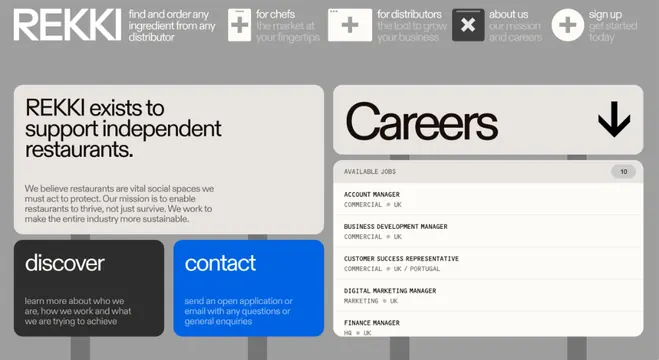
A professional food-supply B2B website careers page combining a left-side text blurb with a right-side tabbed careers listing, using monochromatic blocks and blue action buttons.
Summary
A professional food-supply B2B website careers page combining a left-side text blurb with a right-side tabbed careers listing, using monochromatic blocks and blue action buttons.
Visual description
The page uses a two-column grid layout: on the left, a dark gray block contains white body copy describing the company's mission, followed by two stacked buttons (a dark discover button and a bright blue contact button with white text). On the right, a light gray panel shows the Careers section header with a dropdown toggle, followed by a list of job titles like "Account Manager" and "Business Development Manager" in smaller sans-serif type. The REKKI masthead and navigation tabs sit at the very top in a neutral palette. Color blocking is strategic and minimal: whites, grays, and blacks for structure; cobalt blue reserved exclusively for the primary CTA button to draw attention.
Key takeaway
The disciplined two-column split that pairs human voice (copy + CTAs) with data (a browseable list), and the use of a single vibrant blue accent color that anchors all interaction points while the rest remains neutral and grid-locked. The dropdown toggle pattern for revealing related content is a common B2B convention here executed cleanly.
Reuse notes
A strong template for B2B service-company pages (recruitment, sales, marketplace). The two-column structure works well on desktop; review responsiveness on mobile. The blue-on-dark button treatment is effective for calls-to-action in low-saturation layouts.
More like this



Keep what you find
A free account saves references to boards and can send you a weekly email of picks based on what you save.
To see every result, go Pro.