Preview image. Unlock full-res
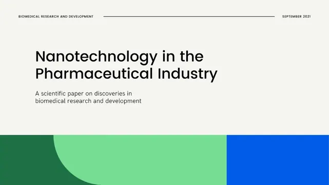
Scientific publication cover using clean typography over cream background with teal and blue color blocks anchoring the lower half.
Summary
Scientific white paper cover pairing oversized sans-serif headline over cream paper with two geometric color blocks (teal and blue) creating compositional weight at the base.
Visual description
A clean title-page layout anchors on pale cream background. Top section: meta information (category, date) in small capitals: "BIOMEDICAL RESEARCH AND DEVELOPMENT" and "SEPTEMBER 2021" appear in a subtle sans-serif, separated by a horizontal line. Below, a large blocky serif or slab-serif "Nanotechnology in the Pharmaceutical Industry" headline commands the upper two-thirds, followed by a two-line subtitle in smaller sans-serif explaining this is a scientific paper on biomedical discoveries. The lower third features two abutting color fields: dark forest green (left, with organic curve) blends into bright mint teal (center) before meeting vibrant cobalt blue (right edge). The geometry is stark, the color transition smooth but bold, reinforcing the shift from text-driven information to visual anchoring.
Key takeaway
The cream-white background with deep type creates document credibility. Modest header information establishes institutional authority. The bold color blocks at the bottom serve purely compositional purpose, adding visual weight and suggesting scientific precision through deliberate geometric form. This approach works for B2B/academic contexts where restraint signals expertise.
Reuse notes
Strong reference for biotech, pharmaceutical, or medical research white papers and technical reports. The teal-green-blue gradient reads as scientific/data-driven. Clean enough for print PDF, progressive enough for web. Avoid if your content is consumer-facing or emotional; this is built for decision-makers and researchers.
More like this



Keep what you find
A free account saves references to boards and can send you a weekly email of picks based on what you save.
To see every result, go Pro.