Preview image. Unlock full-res
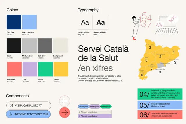
Brand style guide for Servei Catala de la Salut showing navy-blue and light-blue color system, structured typography scale, numbered regional map, and labeled component buttons.
Summary
Brand style guide for Servei Catala de la Salut showing navy-blue and light-blue color system, structured typography scale, numbered regional map, and labeled component buttons.
Visual description
A comprehensive brand-guidelines reference sheet divided into four sections. Top-left: color palette showing dark navy, light sky-blue, black, light gray, medium gray, cream, coral-red, light purple, teal, and bright yellow. Top-right: typography section with "Aa" display type samples labeled Headline Bold and Headline Regular, plus icon illustrations and a yellow numbered map of Catalan regions (zones 1-10). Bottom-left: horizontal gray lines representing text hierarchy or rhythm. Bottom-right: component buttons on light gray, including white pill-shaped tags labeled "VISITA CATSALUT.CAT", "INFORME D'ACTIVITATS 2019", navigation links in navy/teal, rounded radio buttons, and green/blue/red numbered information blocks (04/05/06 with descriptive text).
Key takeaway
The restrained color palette (two primary blues + neutrals + small accent pops) maintains institutional trust while remaining modern. Grid-based layout with clear section labeling makes the guide scannable. Flat button styles and simple iconography keep the system lightweight and reproducible across platforms.
Reuse notes
Ideal reference for government, public health, or institutional services that need to project trustworthiness and accessibility. The navy-to-light-blue gradient works for public-sector digital products. Pair with simple sans-serif type and spare use of accent colors. The structured regions and button components transfer well to healthcare portals or citizen-facing services.
More like this






Keep what you find
A free account saves references to boards and can send you a weekly email of picks based on what you save.
To see every result, go Pro.