Preview image. Unlock full-res
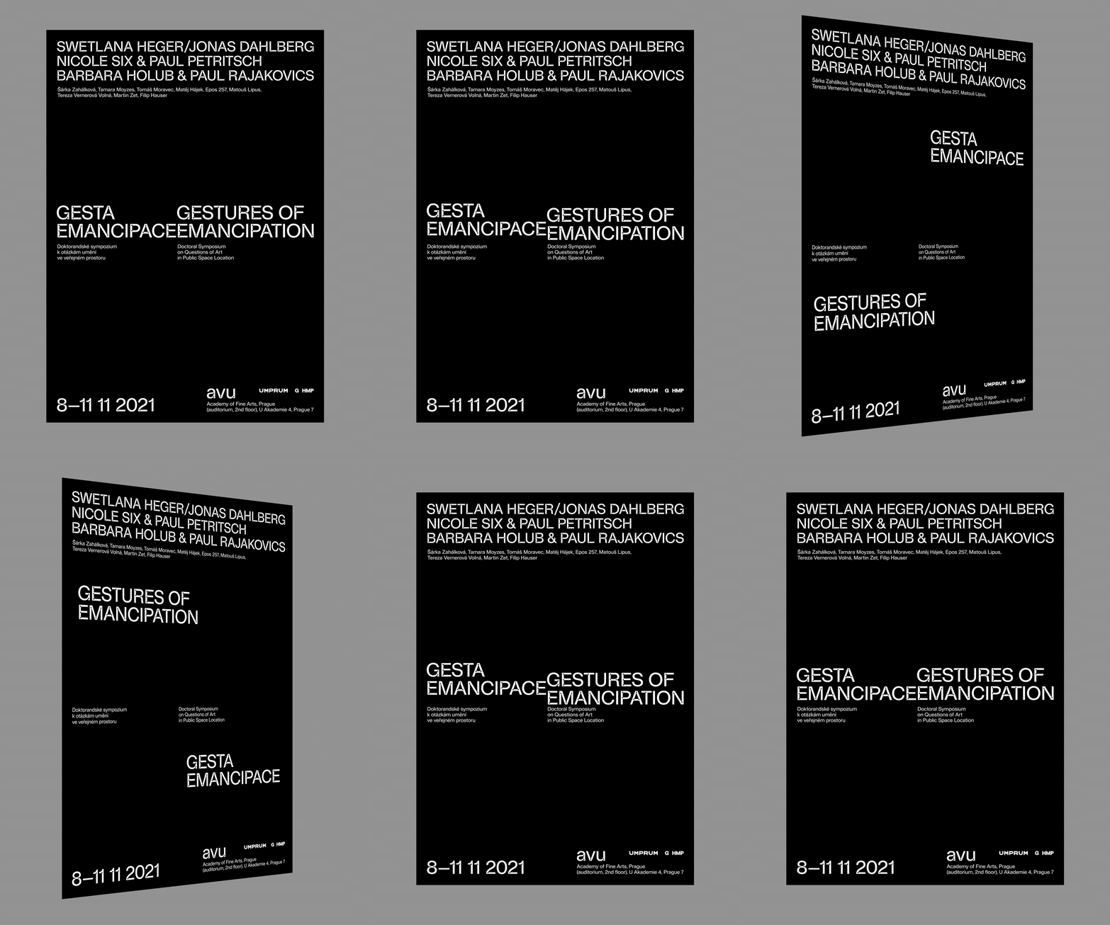
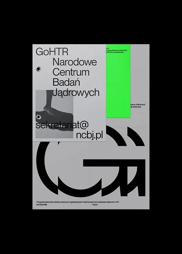
A gallery exhibition poster using stark black and gray color blocks with minimal sans-serif typography arranged in a vertical hierarchy.
Summary
A gallery exhibition poster built from blocky black and gray color fields, with minimal sans-serif type arranged to maximize whitespace and create bold visual rhythm.
Visual description
Black background with gray accent rectangles and typographic elements positioned at strategic intervals. Display-weight sans-serif type in white and light gray, likely Helvetica or equivalent, set at various scales to create visual hierarchy. The composition uses generous spacing and edge-to-edge color blocks to establish a stark, intellectual aesthetic. Text appears structured as a manifesto or exhibition brief, reading vertically with deliberate pauses.
Key takeaway
The use of color blockiness (pure black on gray) as both background and compositional anchor. The scaling and spacing of typography to imply reading order without ornament. The stark, high-contrast palette conveys cultural authority with zero decoration.
Reuse notes
Strong reference for institutional, educational, or cultural work where authority and clarity matter more than friendliness. Works well for exhibition design, academic publishing, and cultural events. Avoid in contexts requiring warmth or approachability.
More like this


Keep what you find
A free account saves references to boards and can send you a weekly email of picks based on what you save.
To see every result, go Pro.