Preview image. Unlock full-res
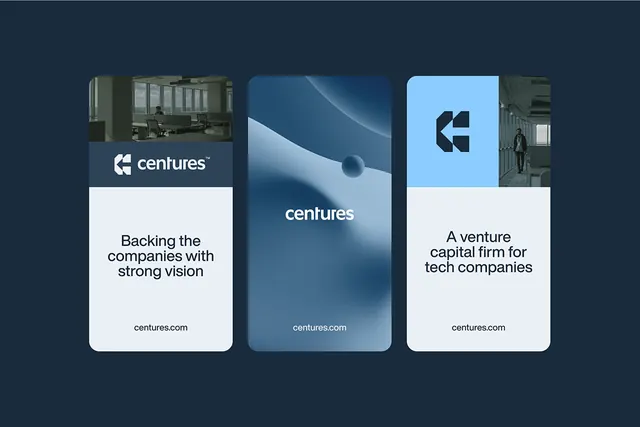
Three-card layout for Centuries venture capital firm, pairing office photography with geometric assets and messaging on a dark navy background.
Summary
Three-card promotional layout for Centuries, a venture capital firm backing tech companies, combining office photography with minimal geometric shapes and sans-serif messaging on a dark navy ground.
Visual description
Dark navy background with three vertically-stacked cards arranged horizontally. Left card: office space photograph with Centuries wordmark in white sans-serif below. Center card: abstract spherical form in light blue on a navy-to-blue gradient, with "centuries" in light sans-serif type. Right card: light blue background with geometric arrow or compass mark and tagline "A venture capital firm for tech companies" in bold sans-serif, plus centuries.com URL. Each card has ample internal padding and the composition uses high contrast between navy and sky-blue tones.
Key takeaway
The card stack as a narrative structure: photograph, abstract symbol, statement. Each card uses consistent horizontal spacing and typography alignment while visual variety (photo, gradient, solid color) prevents monotony. The centered wordmark placement and paired messaging work well for corporate identity systems.
Reuse notes
Strong for fintech or investor-facing materials. The photography-to-abstraction flow suits pitch decks or capability statements. Works best on dark backgrounds; adapt color palette if moving to light.
More like this





Keep what you find
A free account saves references to boards and can send you a weekly email of picks based on what you save.
To see every result, go Pro.