Preview image. Unlock full-res
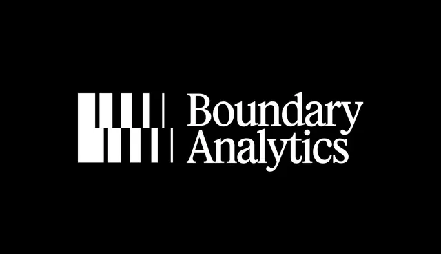
Logotype for Boundary Analytics pairing a minimalist bar-chart mark with serif type, using strict monochrome palette for a data-driven, professional identity.
Summary
Logotype for Boundary Analytics combining a geometric bar-chart mark with a serif company name in strict black and white for a data-driven, precision-focused brand.
Visual description
A monochrome logotype set on black: a geometric mark of vertical bars (some solid, some outlined) in white sits to the left, suggesting a bar chart or data boundary line; to its right, "Boundary Analytics" in a classical serif typeface (full caps), rendered in white. The arrangement is perfectly balanced, with the mark occupying roughly one-quarter of the horizontal space and the wordmark stretching the remainder. No color, no gradients, no embellishment. The stark contrast and geometric simplicity convey precision, data expertise, and institutional trust.
Key takeaway
The use of a data-visualization element (the bar mark) as a core identity component that reinforces the company's domain without being literal or heavy-handed. The serif typeface choice provides gravitas and formal authority, contrasting subtly against the modern geometric mark. The full-width composition and balanced negative space make this mark as strong at small sizes as at large.
Reuse notes
Exemplary for fintech, analytics, data, or B2B SaaS brands seeking a conservative, trustworthy identity. The monochrome treatment ensures scalability and legibility across media. Works equally well on light or dark backgrounds (inverting colors). The symmetry and geometric restraint make it memorable without trendiness. Avoid color variants; the power lies in the contrast.
More like this




Keep what you find
A free account saves references to boards and can send you a weekly email of picks based on what you save.
To see every result, go Pro.