Preview image. Unlock full-res
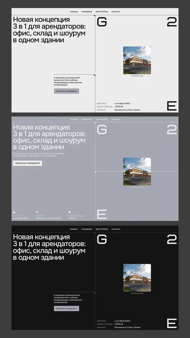
Three-panel layout for a commercial real estate brand with structured Cyrillic headline, descriptive body text, property photography, and oversized display numerals.
Summary
A three-panel commercial real estate identity system using strict typographic hierarchy, Cyrillic display fonts, building photography, and oversized numerals to signal premium professional positioning.
Visual description
Three identical layouts stacked vertically, each with a white or dark panel on the left anchoring a large Cyrillic headline and body text, a property image on the right, and a single oversized numeral (2, E, E) positioned to break the grid. The palette shifts: top panel is white with black text, middle is muted blue-gray with white text, bottom is near-black with white text. All use the same sans-serif weight and spacing strategy. The building imagery is cropped square and sits at the same scale in all three variants.
Key takeaway
The use of a single oversized numeral as a visual anchor and identifier; the constraint of identical copy position across color variants (showing rigorous template discipline); structured grid that lets three different color schemes feel like one system.
Reuse notes
Strong for corporate real estate, property management, or B2B services where professional restraint and typographic clarity matter. The Cyrillic headline is locale-specific; swap for your language but keep the oversized display numeral and color-variant pattern.
More like this





Keep what you find
A free account saves references to boards and can send you a weekly email of picks based on what you save.
To see every result, go Pro.