Preview image. Unlock full-res
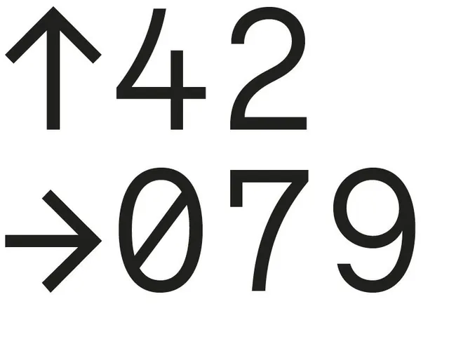
Cropped black-on-white type specimen pairing oversized monospaced digits with an up arrow and a right arrow.
Summary
A tightly cropped typographic composition: two lines of huge monospaced digits, "42" preceded by an upward arrow and "079" preceded by a rightward arrow, set black on white.
Visual description
Two rows of oversized characters fill the frame edge to edge. The top row reads an up arrow followed by "42"; the bottom row reads a right arrow followed by "079". The typeface is a thin-to-medium weight monospaced grotesque with open, geometric digit forms and a slashed zero; the arrows are drawn at the same stroke weight so glyphs and symbols read as one system. Characters crop off the right and bottom edges, and generous counter space keeps the dense crop legible. Pure black on white, no other elements.
Key takeaway
Numerals plus same-weight arrow glyphs make raw data feel designed: direction and value read instantly as a unit. Cropping oversized type at the frame edges adds tension without any additional graphic device.
Reuse notes
Reach for this when styling stat callouts, dashboards, annual-report figures, wayfinding, or kinetic type frames where numbers are the hero. The slashed-zero monospace look leans technical/engineering; pair with a neutral sans for labels. Works equally well inverted on dark.
More like this

Keep what you find
A free account saves references to boards and can send you a weekly email of picks based on what you save.
To see every result, go Pro.