
Preview image. Unlock full-res
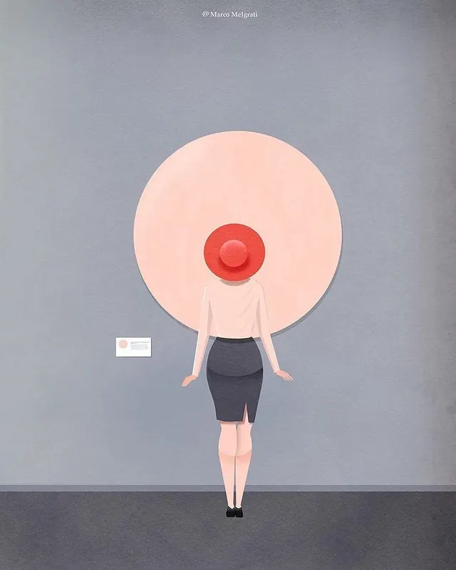
A neutral-toned composition balancing soft beige and warm gray with dark charcoal, creating subtle tonal depth.
Summary
A neutral-toned composition balancing soft beige and warm gray with dark charcoal, creating subtle tonal depth.
Visual description
The composition features a muted color palette dominated by #DBD9D3 tones, accented with #4B525E. The visual treatment emphasizes minimal, flat aesthetic with calm, professional mood. Careful color balance and tonal arrangement create a calm and professional impression.
Key takeaway
This is a focused color and composition study valuable for palette inspiration and understanding how multiple hues can be balanced in a refined way. The restraint and harmony demonstrate effective color strategy.
Reuse notes
Use for color palette reference, color harmony inspiration, or as a study of how complementary and analogous colors interact. Works well for branding, editorial design, or as a starting point for a custom color system. The muted intensity makes it suitable for both luxury and minimalist applications.
More like this








Keep what you find
A free account saves references to boards and can send you a weekly email of picks based on what you save.
To see every result, go Pro.