Preview image. Unlock full-res
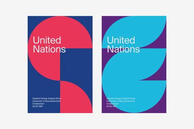
A design system showcase featuring the United Nations branding with bold primary colors (blue, red, yellow) arranged in structured composition, exemplifying iconic organizational identity.
Summary
The United Nations identity system showcase by OAKES, demonstrating structured application of the iconic blue, red, and yellow brand palette in systematic layout and composition.
Visual description
The composition features the UN's primary brand colors (#21B4D9 blue, #E03658 red, #303682 navy) arranged in a structured, geometric layout against light background (#F2F2F2). The colors are used in distinct blocks or sections, showing system consistency and versatility. The layout demonstrates disciplined color blocking and organizational hierarchy, typical of institutional identity documentation.
Key takeaway
The enduring power of primary color systems: the UN palette remains instantly recognizable despite its simplicity. The structured presentation demonstrates how color can communicate authority and internationalism. Constraint in palette creates memorable brand presence.
Reuse notes
Excellent reference for institutional, governmental, or international brand systems. Use when seeking authoritative color palettes. The primary color combination is universally readable and translates well across media. Suitable for nonprofit, governmental, or large organizational branding. The color blocking system pairs well with geometric layouts and clean sans-serif typography. Strong reference for brand guidelines documentation.
More like this


Keep what you find
A free account saves references to boards and can send you a weekly email of picks based on what you save.
To see every result, go Pro.