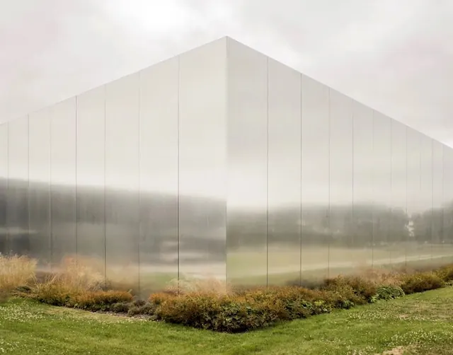
Preview image. Unlock full-res
A minimalist abstract composition of flat, soft neutral and warm tones arranged in organic shapes, suggesting simplicity and serene calm.
Summary
A serene abstract composition of soft, flat color fields in warm beiges and muted taupe tones, emphasizing simplicity and emotional tranquility.
Visual description
The landscape-oriented composition (920x721) uses flat, unmodulated color shapes in a highly restricted palette of warm, muted neutrals—soft beiges (#e8e7e5), dusty rose tones (#e4dbdc), and warm gray (#e3dfd6). The shapes appear organic and irregular, with soft edges and gentle curves that suggest natural forms without depicting anything specific. The entire image feels harmonious and peaceful, with no contrasting elements or jarring transitions. The subtle tonal variations create gentle visual movement without drama.
Key takeaway
How to create visual interest and emotional resonance through extremely limited color palette and simple shapes; restraint as a design strength.
Reuse notes
Excellent for wellness, meditation, or lifestyle brands. Works well as a calm, minimal background or header. The soft palette creates an approachable, human feel without being childish. Pairs well with light typography or as a foundation for more complex designs layered on top. Perfect for apps or interfaces focused on relaxation or focus.
More like this



Keep what you find
A free account saves references to boards and can send you a weekly email of picks based on what you save.
To see every result, go Pro.