Preview image. Unlock full-res
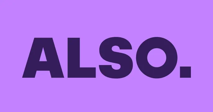
Bold minimal OG card with a heavy dark "ALSO." wordmark and oversized period set large and centered on a flat lilac field.
Summary
A pure typographic OG card: the brand name "ALSO." set huge and heavy in deep purple, centered on a flat lilac background with an emphatic full stop.
Visual description
A single flat lilac/light-purple field fills the frame. Centered on it, "ALSO." appears in a very bold dark-violet all-caps sans-serif, the letterforms wide and tightly set, ending in an oversized square period that nearly matches the cap height. Two-tone and nothing else, no logo glyph, tagline, photo, or pattern. The contrast of the dark mark on the pale lilac is high but tonal (both purple), giving a confident, branded calm.
Key takeaway
Maxing the wordmark to fill the canvas and punctuating it with a deliberate oversized period turns a plain name into a graphic statement. Keeping both colors in the same hue family (dark purple on light purple) feels intentional and owned.
Reuse notes
A strong default when the brand name is short and the identity is type-led. Works for hardware, mobility, or app brands wanting bold simplicity. Swap the two-tone palette to any brand pairing; the move is type scale plus the punctuation, not the color.