Preview image. Unlock full-res
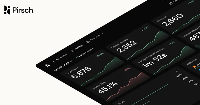
Light card with the "Pirsch" logo top-left and a large, perspective-tilted dark analytics dashboard showing big metric tiles and green trend lines.
Summary
A light card with the "Pirsch" logo in the top-left corner and a large dark analytics dashboard tilted into perspective, its metric tiles and green-and-red trend lines receding into the frame. The angled, oversized dashboard render is the defining move.
Visual description
The background is a soft warm off-white. Top-left shows the Pirsch logo mark (an abstract dotted glyph) beside the "Pirsch" wordmark in black. Filling the lower-right two-thirds is a dark dashboard rendered on a slight 3D tilt, as if laid back on a surface, so the tiles grow larger toward the lower-left. Each tile is a near-black card with a label and a very large white number: "Page Views 6,876," "Unique Visitors 2,352," "Sessions 2,660," "Average Session Duration 1m 52s," "Bounce Rate 45.1%," plus partial "Unique Visitors" and "Referrers" tiles. Thin green area-line sparklines rise behind several tiles, with one red downtrend on the bounce-rate card and small percentage deltas in the corners. A top toolbar shows "acme.com," "Add Domain," "Settings," "Resources," and "12 active visitors."
Key takeaway
Presenting a dark product dashboard in a dramatic perspective tilt so the oversized metric numbers become the visual, while a small logo holds the corner. The angle adds depth and dynamism that a flat screenshot lacks, and the huge numbers read instantly even at thumbnail size.
Reuse notes
Best for analytics, monitoring, or any data product whose dashboard is the hero, especially dark-themed UIs. Works on a light neutral ground that contrasts the dark panel. The perspective crop means edge tiles get cut, so keep the most important metrics toward the visible center. Pairs a quiet corner logo with a loud product render.
More like this







Keep what you find
A free account saves references to boards and can send you a weekly email of picks based on what you save.
To see every result, go Pro.