Preview image. Unlock full-res
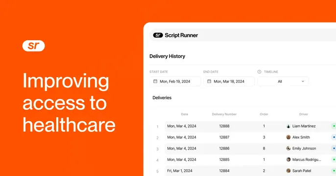
Split OG card with an oversized white headline on a bright orange panel and a delivery-history product screenshot on the right.
Summary
A high-energy split OG card: a saturated orange panel carries the headline and logo on the left while a clean delivery-tracking screenshot fills the right.
Visual description
The left third is a solid bright-orange block holding a white rounded "sr" badge logo and an oversized white four-line headline, "Improving access to healthcare." The right two-thirds is a white product window labeled "Script Runner / Delivery History" with start- and end-date pickers and a "Timeline / All" dropdown, beneath a "Deliveries" data table listing dated rows with delivery numbers, order counts and named drivers (Liam Martinez, Alex Smith, Emily Johnson) each with a small round avatar and a colored status dot.
Key takeaway
The hard split between a single saturated color panel and a clean white UI gives instant brand recognition plus product proof. The orange block frames the headline so type needs no other treatment. Avatars and status dots make the table feel human and alive.
Reuse notes
Reach for this when one brand color is strong enough to own a third of the frame. Keep the table rows few and the headline short; the right panel is cropped, so put the most legible UI near the visible edge. Works in light mode with any vivid brand hue.