
Preview image. Unlock full-res
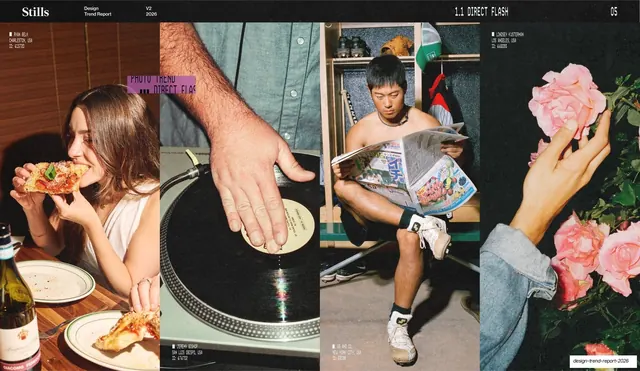
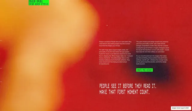
A 45-slide photography trend report by Stills that pairs a strict monospace editorial grid with oversized stencil display headlines, full-bleed photo spreads, and saturated lime-green and red accent slides.
Summary
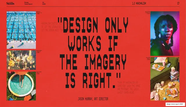
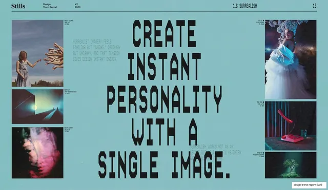
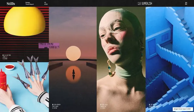
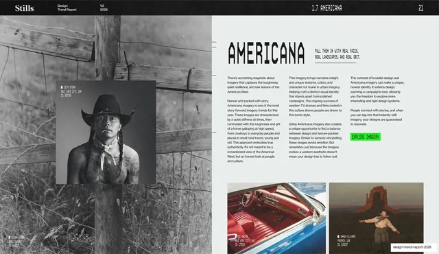
A 45-slide trend report from photo-licensing agency Stills, mapping the photography directions defining 2026. Its identity comes from a rigid magazine grid built on monospace utility type, oversized military-stencil display headlines, and full-bleed photography, punctuated by loud single-color quote slides in lime green and red.
Visual description
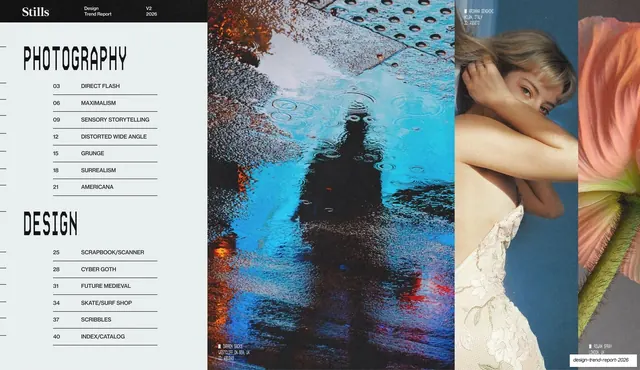
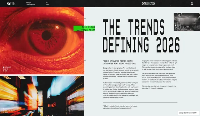
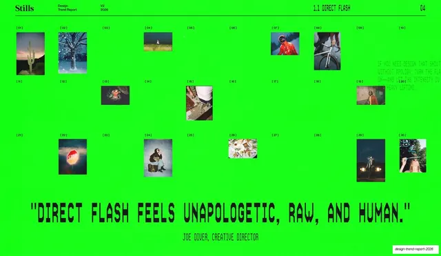
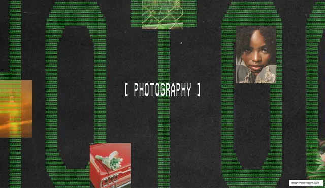
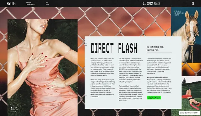
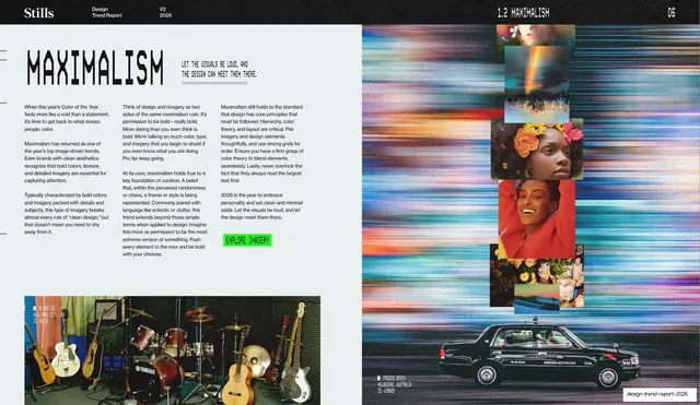
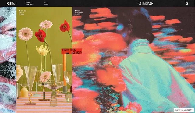
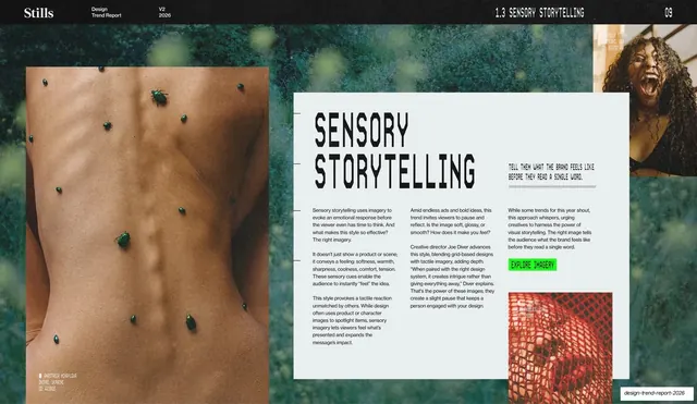
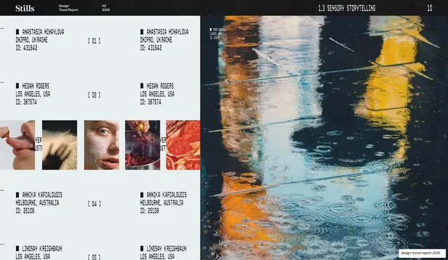
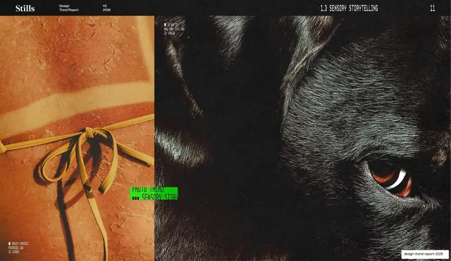
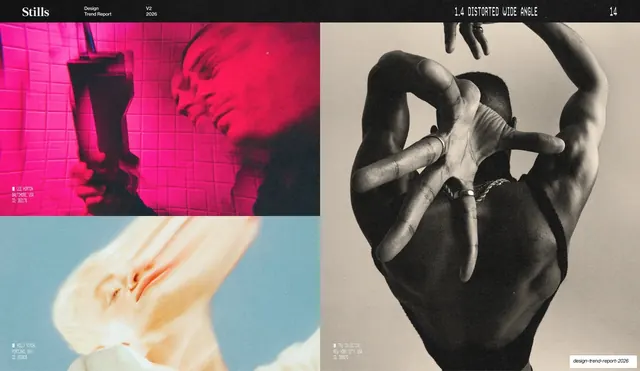
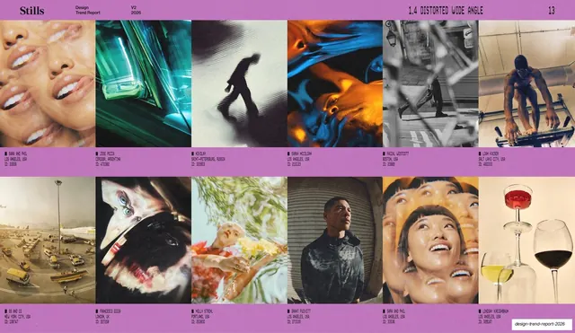
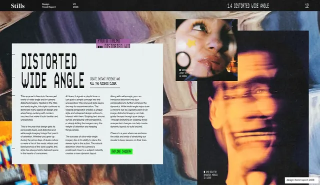
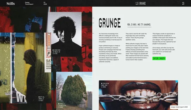
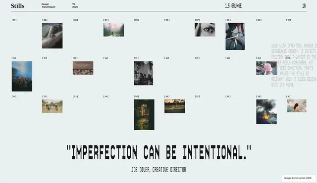
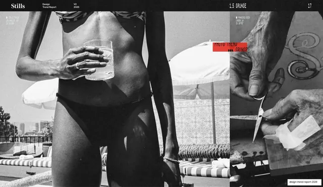
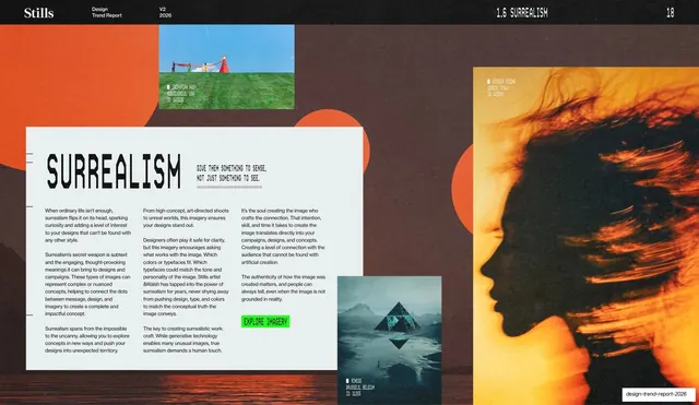
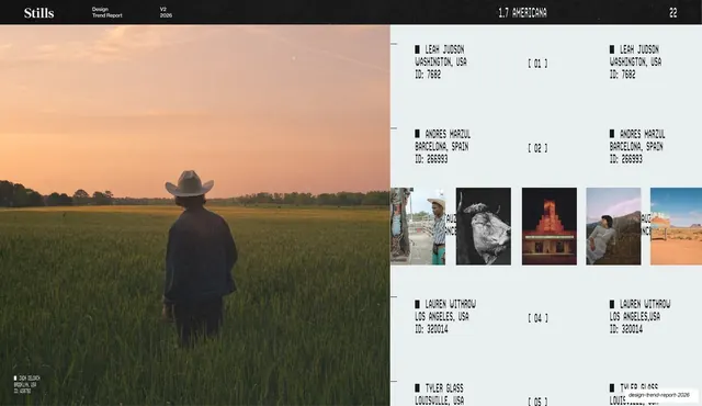
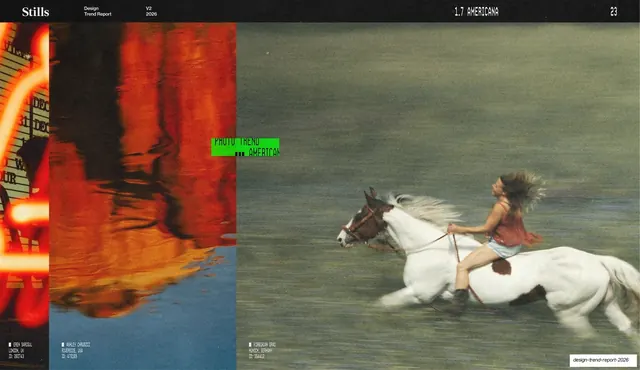
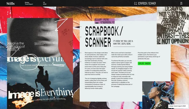
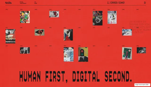
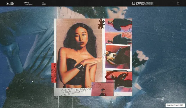
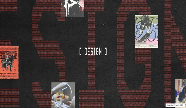
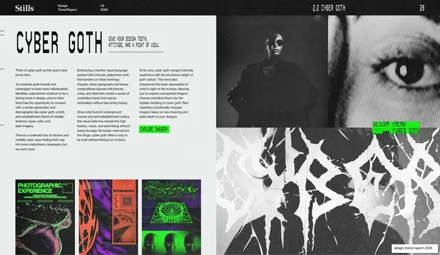
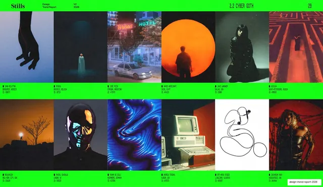
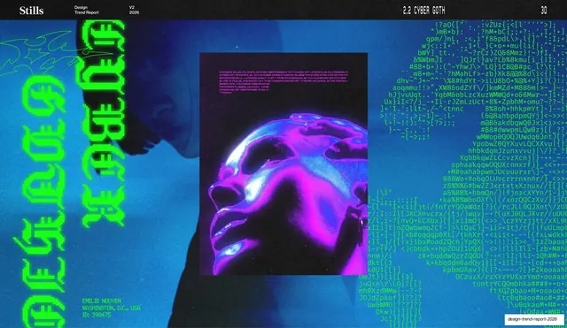
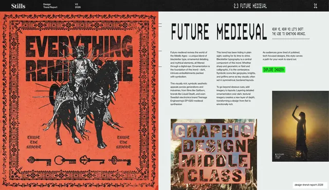
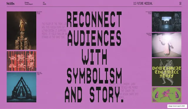
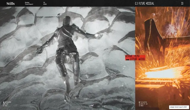
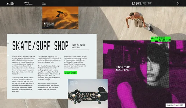
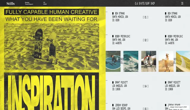
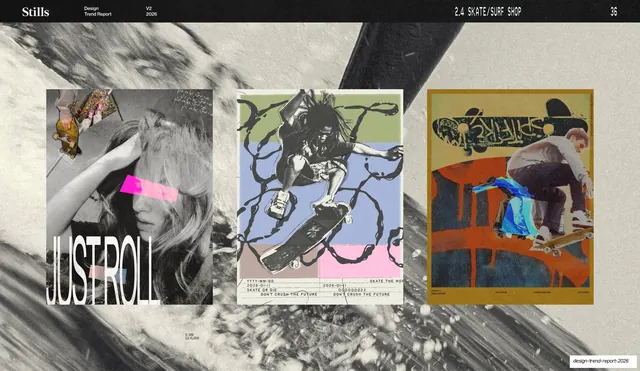
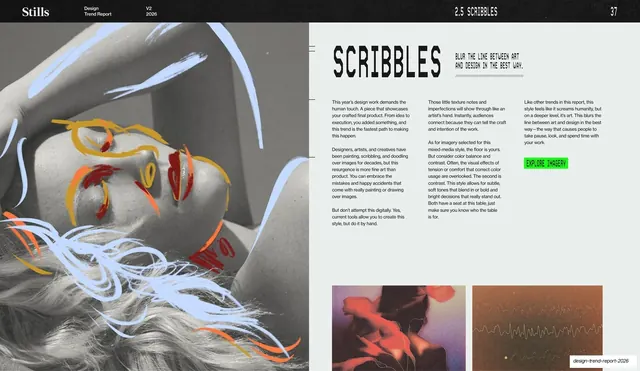
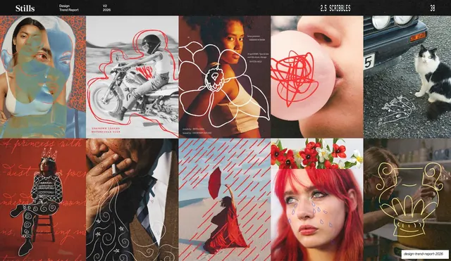
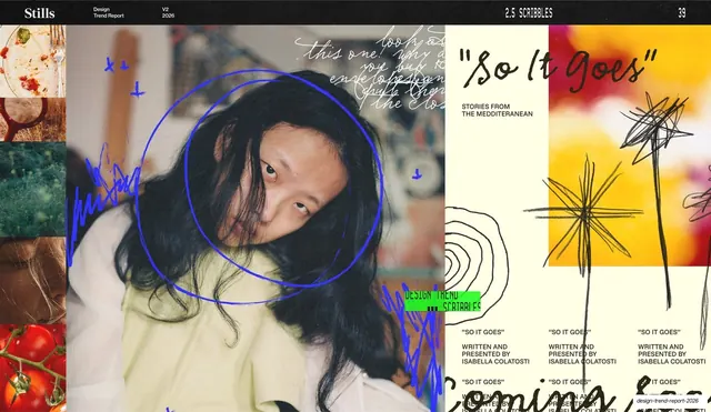
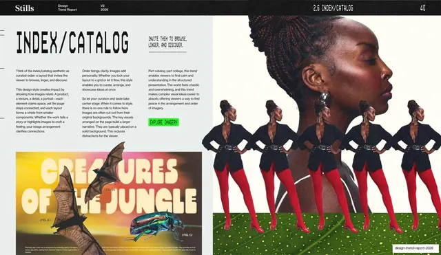
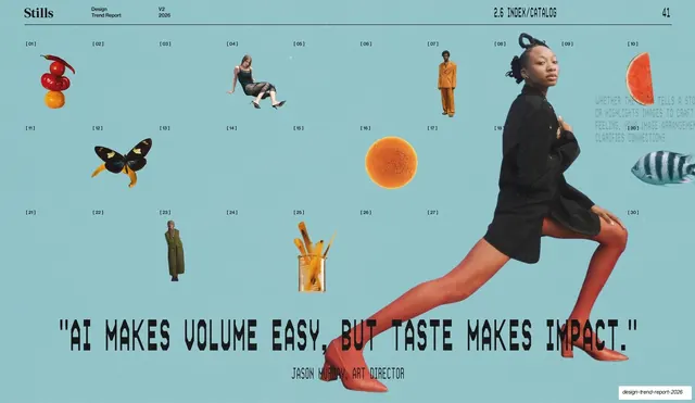
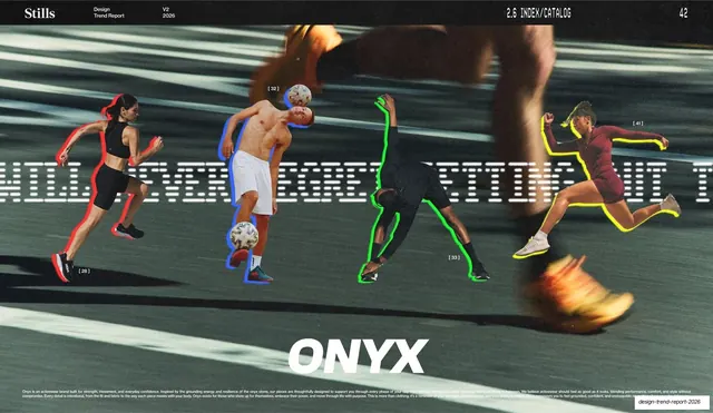
Slides run 16:9 and alternate between near-black and a pale cool off-white (#E8EDEC), with a recurring electric lime-green (#3DF21A) accent and a vivid red (#E8412B) for quote spreads. A fixed running header sits on a hairline rule on almost every interior slide: a serif "Stills" wordmark at left, "Design Trend Report / V2 / 2026" beside it in tiny monospace, a right-aligned all-caps monospace section label ("1.1 DIRECT FLASH", "1.2 MAXIMALISM"), and a two-digit page number at the far right. Type mixes three voices: the elegant serif Stills wordmark, an oversized chunky stencil/condensed display face for headlines and pull-quotes, and monospace for all body copy, captions, and the photographer credit blocks (name, city, ID number) that tag nearly every image. The deck repeats a small set of layouts: a contents index listing two sections (Photography, Design) by page number; per-trend title spreads with a big stencil headline, a short monospace tagline, three columns of body copy, and a small lime-green "EXPLORE IMAGERY" button; full-bleed quote slides on solid green or red carrying a grid of small numbered thumbnails above a giant rounded-display quote and an attribution; example grids and filmstrips of photography; and full-bleed paired-image spreads. Two recurring textural motifs appear: an ASCII/binary "code-rain" texture used on section dividers, and a glitchy magenta-and-green "PHOTO TREND / [trend name]" sticker baked into the corner of many photos. Imagery leans grainy, flash-lit, and tactile, matching the trends being argued.
Key takeaway
The discipline of a single monospace grid carrying every utility element (header, captions, credits, taglines) so the oversized stencil headlines and full-bleed photos can be loud without the layout getting noisy. The recurring lime-green "EXPLORE IMAGERY" button and per-trend numbered section labels give a long report clear wayfinding. And the move of breaking the quiet editorial pages with full-bleed, single-color quote slides keeps a 45-slide deck paced and punchy.
Reuse notes
A strong reference for trend reports, photography or visual-direction decks, and any long-form editorial deck from an agency or media brand. The fixed monospace running header plus numbered sections is directly reusable for report or index-heavy decks. The credit-block pattern (mono name / city / ID) is a clean way to attribute a lot of imagery. Needs genuinely strong, characterful photography to carry the full-bleed spreads; the stencil headline face is distinctive and central to the look, so swap deliberately.
From this deck: Stills Design Trend Report 2026
View deck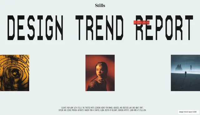
More like this





Keep what you find
A free account saves references to boards and can send you a weekly email of picks based on what you save.
To see every result, go Pro.