
Preview image. Unlock full-res
Typography page setting four weight specimens (Signifier Light, Söhne Buch, Söhne Halbfett, Söhne Mono Buch) at large size beside a left column of usage notes.
Summary
The "4.4 Typography / Weights" page: four large type specimens set in their own faces (Signifier Light, Söhne Buch, Söhne Halbfett, Söhne Mono Buch) with a left column explaining when to use each.
Visual description
White background with the "4.4 / Typography / Weights" header. The narrow left column holds four short paragraphs of black Söhne sans describing the system: Signifier Light for classic/research moments, Söhne as the workhorse sans, Söhne Halbfett for contrast and eyebrows, Söhne Mono for code. The right two-thirds stacks four oversized specimens, each rendered in the very font it names: "Signifier Light" (high-contrast serif), "Söhne Buch" (regular sans), "Söhne Halbfett" (bold sans), "Söhne Mono Buch" (monospace), aligned left and filling the frame.
Key takeaway
The self-demonstrating specimen, each weight's name set in that exact weight, so the page shows and tells at once. Pairing big visual specimens on the right with concise when-to-use notes on the left gives both feel and rule in one view.
Reuse notes
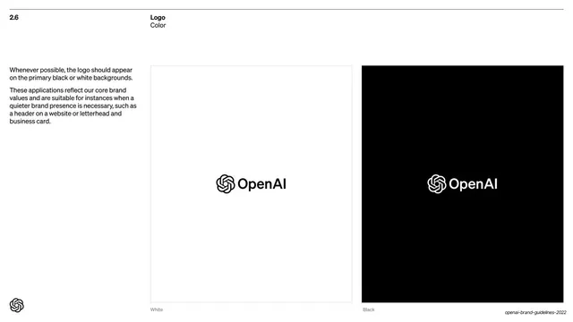
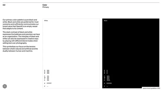
A model typography page for any brand or design system. The name-set-in-its-own-face trick is universally reusable. Keep the usage notes terse and the specimens large; the left-notes / right-specimens split matches the deck's logo and color pages for consistency.
From this deck: Typography weights specimen
View deck


More like this






Keep what you find
A free account saves references to boards and can send you a weekly email of picks based on what you save.
To see every result, go Pro.