Preview image. Unlock full-res
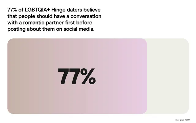
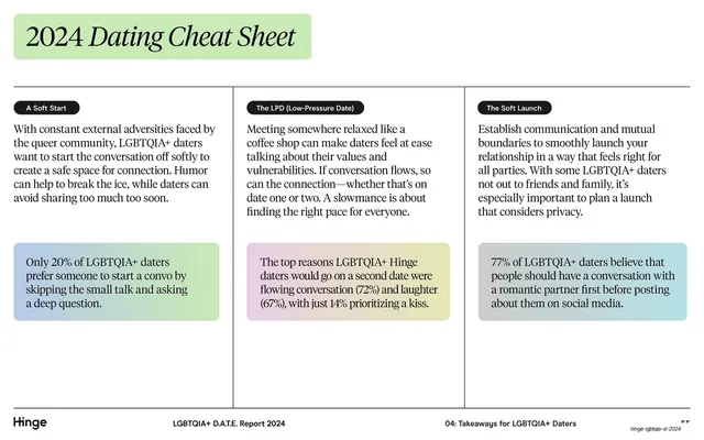
A single big "77%" sits inside a pink-to-cream gradient rounded card beneath a sans-serif headline about talking before posting.
Summary
A single-statistic slide built around an oversized black "77%" centered in a wide pink-to-cream gradient card, under a four-line sans-serif headline.
Visual description
White background. A four-line sans-serif headline sits top-left stating that 77% of daters believe in talking before posting. Below it spans a large rounded-rectangle card whose fill is a soft mauve-pink gradient occupying most of the width, with a pale cream segment to its right, reading like a partially filled bar. A very large bold black "77%" is centered within the pink portion. Only the small italic deck-slug annotation sits bottom-right; no full footer rule appears.
Key takeaway
Turning one statistic into the entire slide: a giant percentage inside a gradient card that doubles as a subtle progress bar (filled pink vs. empty cream). The restraint makes the number unmissable.
Reuse notes
Ideal for a headline metric you want to land hard, with no chart clutter. The gradient-as-bar trick communicates proportion at a glance. Reuse sparingly across a deck so the oversized-number moment keeps its impact.
From this deck: 77% conversation-before-posting big stat card
View deck







More like this







Keep what you find
A free account saves references to boards and can send you a weekly email of picks based on what you save.
To see every result, go Pro.