Preview image. Unlock full-res
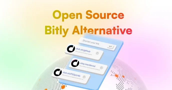
Pale-gradient card with a rainbow-gradient "Open Source Bitly Alternative" headline above a tilted blue panel of shortened-link cards floating over a dotted globe.
Summary
A soft pastel card with a warm rainbow-gradient headline calling Dub an "Open Source Bitly Alternative," set above a tilted blue 3D panel stacking shortened-link cards over a faint dotted globe.
Visual description
Pale cream-to-pink gradient background. The two-line headline "Open Source Bitly Alternative" runs across the top in a bold sans filled with a yellow-to-orange-to-pink-to-red horizontal gradient. Below, a blue rounded panel is tilted back in perspective; on it float a "Shorten your link" input and three white link cards each showing the Dub mark, a short URL (dub.sh/github, stey.me/devrel, dub.sh/P5SpU4b) and the long destination beneath. A pale dotted half-globe and scattered orange halftone dots sit behind the panel at the bottom.
Key takeaway
The warm gradient fill on the headline ties the type to the soft background while still popping. Floating the product UI on a tilted panel over a dotted globe gives depth and a global, link-everywhere feel without a literal map.
Reuse notes
Fits a developer tool or link/URL product that wants an energetic, modern look. The perspective panel needs clean UI cards to read at small size. Gradient-on-gradient keeps contrast moderate, so keep the headline weight heavy.