Preview image. Unlock full-res
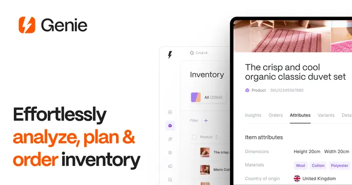
Split light OG card with a left headline that emphasizes key words in orange and a right-side inventory app screenshot of a product detail view.
Summary
A clean white split card: a left headline using orange to highlight the action words, and a right-side inventory-management screenshot showing a product detail screen. The defining move is selective orange emphasis tying the copy to the brand mark.
Visual description
White background. Top-left shows an orange lightning-bolt Genie mark beside the black "Genie" wordmark. The left column carries a bold headline "Effortlessly analyze, plan & order inventory" where "analyze, plan &" and "order" are set in the brand orange while the rest stays black. The right portion is a screenshot of the Genie inventory app: a left panel listing inventory items and a detail view of an "organic classic duvet set" with attributes, materials shown as colored tags, and a country-of-origin row. The UI is light and tidy.
Key takeaway
Using one accent color (orange, pulled straight from the logo) to highlight only the verbs in the headline, so the eye reads the action first while the rest of the sentence stays calm and the product screenshot does the proof.
Reuse notes
Solid for a light-mode B2B or ecommerce SaaS that wants a friendly but professional tone and an interface worth showing. The keyword-highlight trick scales to many headlines. Keep the highlighted words to the few that matter, or the emphasis dilutes.