Preview image. Unlock full-res
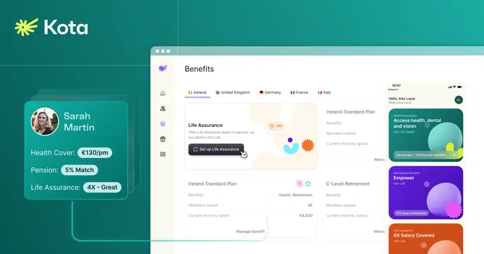
Teal-gradient OG card pairing the Kota wordmark with a layered product dashboard and a floating benefits card.
Summary
A product-led OG card on a teal gradient: the Kota logo and wordmark sit top-left while a large benefits dashboard and a floating employee benefits card fill the rest of the frame.
Visual description
The background is a deep teal-to-green gradient. Top-left carries a yellow-green starburst logo with the Kota wordmark in white. A small floating card overlaps the lower-left, showing a headshot for "Sarah Martin" with health cover, pension and life assurance rows. Dominating the right two-thirds is a light-UI Benefits dashboard with a country tab row (Ireland, United Kingdom, Germany, France, Italy), plan cards, and a stacked list of colorful benefit tiles down the far right. Everything reads as real product UI floated on the gradient rather than a flat illustration.
Key takeaway
Floating a genuine, detailed product dashboard over a brand-color gradient sells the software directly. The small personal benefits card in front adds a human, concrete data point against the abstract dashboard behind it.
Reuse notes
Strong for HR, benefits, or any data-rich SaaS where the dashboard itself is the selling point. Needs a clean, legible product UI; the dense screenshot can feel busy at small share sizes, so keep the wordmark and one focal card readable.