Preview image. Unlock full-res
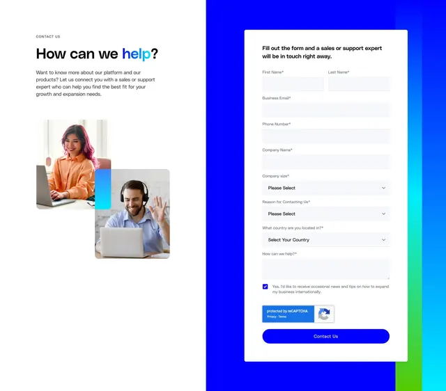
Split contact section with lifestyle photography and gradient headline on the left, and a detailed lead form on a bright blue panel on the right.
Summary
A two-column contact page pairing warm lifestyle imagery and a gradient-accent headline with a comprehensive sales/support lead form on a saturated blue background.
Visual description
Left half is white with a small grey "CONTACT US" label, a large bold headline "How can we help?" where "help?" uses a blue-to-cyan gradient, and a short supporting paragraph. Below, two overlapping rounded-corner photos show people on laptops and video calls, separated by a thin vertical blue-to-green gradient bar. Right half is a full-height bright blue panel with a multicolor vertical stripe along the far edge. A white rounded card holds the form: paired first/last name fields, business email, phone, company name, three dropdowns (company size, reason for contact, country), a message textarea, a pre-checked marketing consent checkbox, reCAPTCHA badge, and a full-width bright blue "Contact Us" pill button. Required fields marked with asterisks.
Key takeaway
The overlapping lifestyle photos with a gradient divider add humanity without competing with the form. Keeping the form in a white card on a bold color field makes a long multi-field form feel contained and scannable.
Reuse notes
Strong pattern for B2B sales or support contact pages where the form is detailed but the left rail stays approachable. The blue panel and gradient stripe are signature G-P branding; adapt the palette for other brands. Long forms will stack on mobile; the split layout needs a clear breakpoint plan.