Preview image. Unlock full-res
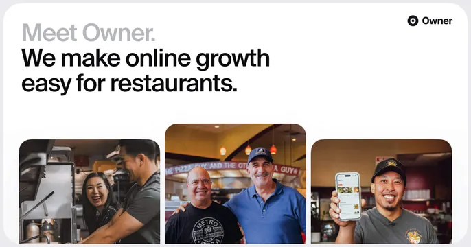
Clean white OG card with a two-tone headline top-left and a row of three rounded restaurant lifestyle photos along the bottom.
Summary
A bright white card with a two-tone headline top-left and a strip of three rounded photographs of restaurant owners along the bottom.
Visual description
White rounded-corner card. Top-left holds a headline where "Meet Owner." sits in light grey and "We make online growth easy for restaurants." follows in bold black across three lines. The Owner target-logomark and wordmark sit top-right. The lower half is a row of three equal rounded-rectangle photographs: a person laughing in a kitchen, two smiling restaurant owners in front of a pizza counter, and a person holding up a phone showing the Owner app, all warm, candid and human.
Key takeaway
A clean white field with a quiet grey intro phrase leading into a bold black promise, anchored by a tidy three-photo strip. The trio of candid customer photos sells the audience and outcome without any product UI in the headline area.
Reuse notes
Good for a vertical SaaS that serves a relatable customer (here, restaurant owners) and has authentic photography. The white ground needs warm photos to avoid feeling clinical. The three-up strip scales down cleanly and reads as real customers.