Preview image. Unlock full-res
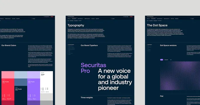
Three dark navy brand-guideline pages shown as floating mockups on a light grey ground, previewing the contents of a brand portal.
Summary
A three-up showcase of brand-portal pages: three dark navy guideline screens float side by side on a light grey field, previewing the color, typography, and motion sections of a brand system.
Visual description
A light grey background holds three near-identical dark navy page mockups arranged in a row, each clipped at top and bottom so only the upper portion shows. Left page is a "Brand Colors" spread with a stacked block of red, blue, and purple swatch tiles and dense spec text. Center page leads with a large mixed headline, the wordmark "Securitas Pro" in violet beside "A new voice for a global and industry pioneer" in white serif/sans, under a "Typography" header. Right page shows "The Dot Space" with a halftone dot pattern panel. Each page carries a thin top nav and small body copy, reading as real captured screens of a documentation site.
Key takeaway
Using three trimmed page mockups in a row to advertise depth: the OG card itself becomes a table of contents, signaling that the link leads to a rich, multi-section brand portal rather than a single page. The dark navy unifies disparate spreads.
Reuse notes
Ideal for a brand portal, design-system site, documentation hub, or guidelines microsite where the value is breadth of content. Needs genuinely attractive interior pages to carry it. The trimmed screenshots can feel busy at small share sizes, so rely on the shared color and the recognizable wordmark to register.