
Preview image. Unlock full-res
A 29-slide dark investor business-update deck that pairs near-black section dividers with light-grey data slides, oversized grotesque numbers, and white charts inside rounded dark cards.
Summary
Palantir's Q1 2023 quarterly business update for investors and analysts. A disciplined dark corporate report whose personality comes from three moves: alternating near-black section dividers with light warm-grey data slides, oversized grotesque numbers that carry each financial highlight, and white charts dropped into rounded near-black cards.
Visual description
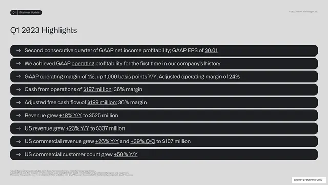
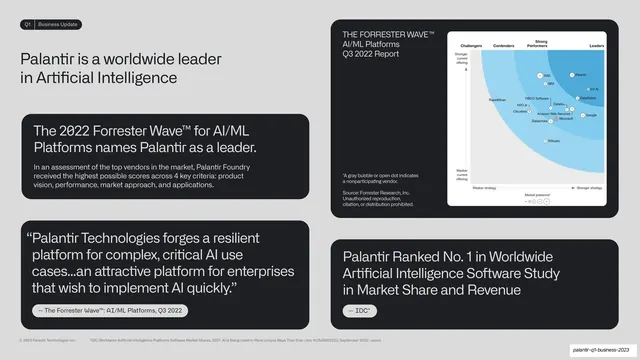
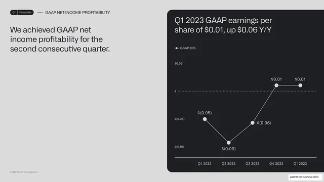
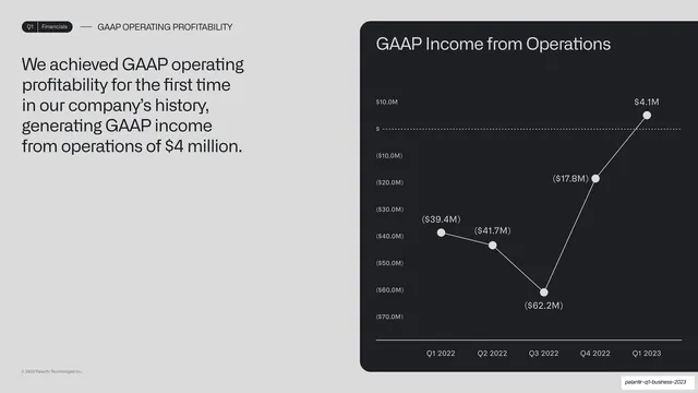
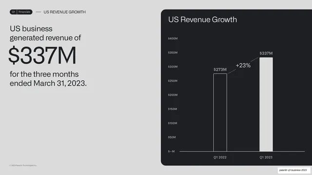
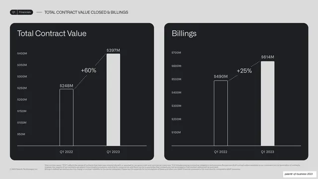
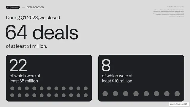
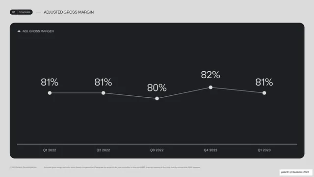
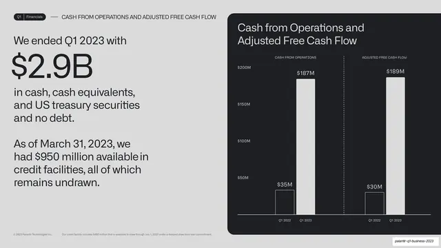
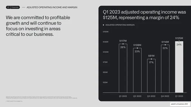
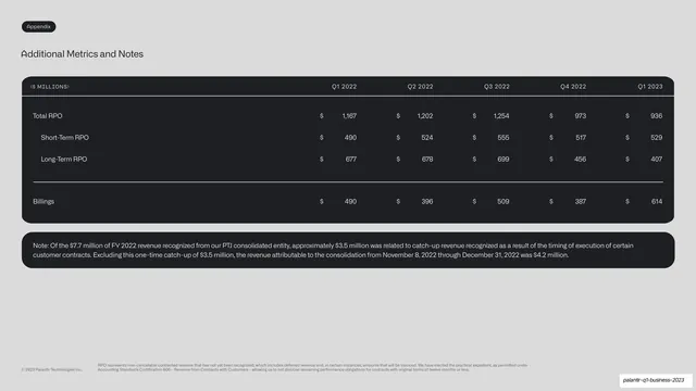
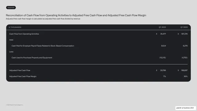
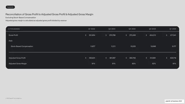
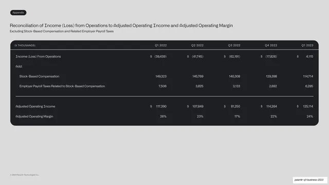
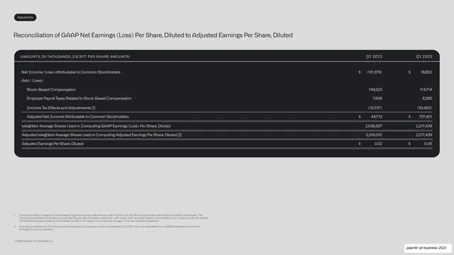
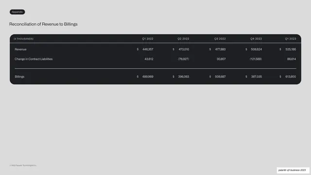
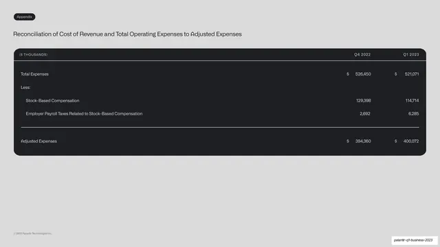
Slides run 16:9 across two background systems. Section dividers (cover, Financials, Appendix) are a single bordered near-black card on a light frame, split by horizontal hairline rules into stacked rows: a large "Q1" top-left, a middle band with the Palantir wordmark left and "2023" right, the big section title in light grey on the lower band, and a four-circle progress indicator (first dot filled) bottom-right. Content slides flip to a light warm-grey field with a consistent running header: a small pill reading "Q1 | [section]" top-left, an em-dash and all-caps section label beside it, and a faint copyright top-right. The dominant grammar is a split: a left column with a humanist grotesque headline (sometimes with one oversized number set very large, like "$337M" or "64 deals"), paired on the right with a chart housed in a rounded near-black card. Charts are monochrome: white line graphs with circular nodes and a dotted zero baseline, or white and outlined bar pairs with dotted "+18%" growth callouts; chart titles sit in light grey, axis labels and legends in a small monospace. Appendix slides drop the dark card to full-width reconciliation tables with monospace column headers ("$ THOUSANDS", quarter columns) and thin dividing rules. Accent color is almost absent, reserved for two small green dots and one red dot in the AIP isometric illustration. The AIP product section breaks the chart rhythm with a custom AIP logomark, a layered isometric exploded diagram, and an orbiting-circles relationship diagram with a faint violet glow.
Key takeaway
The dark-divider / light-data alternation that paces a long financial deck and signals section breaks without decoration. The rounded near-black chart card as a repeatable container that makes every monochrome chart feel like one system. And the highlight-number move: one giant grotesque figure ("$2.9B", "$337M") doing the talking on the left while the proof chart sits on the right.
Reuse notes
A strong reference for investor updates, earnings decks, quarterly business reviews, and any data-heavy B2B or enterprise report that must stay legible and on-brand across 25-plus slides. The chart-card, big-number split, and monospace-headed reconciliation table are directly reusable for financial or metrics decks. The monochrome palette depends on clean charts and disciplined hierarchy; it will read flat if the charts are noisy. The section-divider card and progress dots are a tidy, copyable system for marking deck sections.
From this deck: Palantir Q1 2023 Business Update
View deck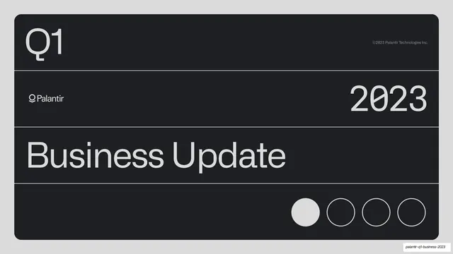



More like this








Keep what you find
A free account saves references to boards and can send you a weekly email of picks based on what you save.
To see every result, go Pro.