
Preview image. Unlock full-res
A 29-slide quarterly earnings deck from Palantir that pairs near-black chart panels with a light-grey field, sets data in a clean grotesque with monospace utility labels, and stays almost entirely greyscale.
Summary
Palantir's Q1 2023 quarterly earnings update, run as a 29-slide investor report. Its design comes from one disciplined system: near-black rounded panels carrying white charts and tables, set against a light-grey field, in a clean grotesque sans with monospace for the small utility labels, kept almost entirely greyscale.
Visual description
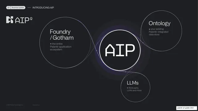
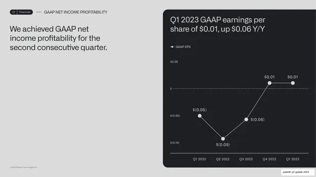
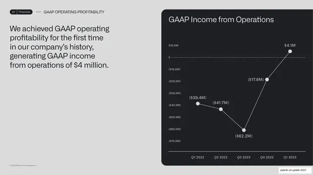
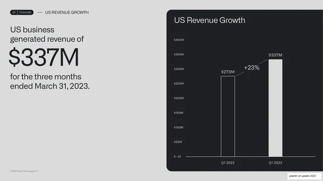
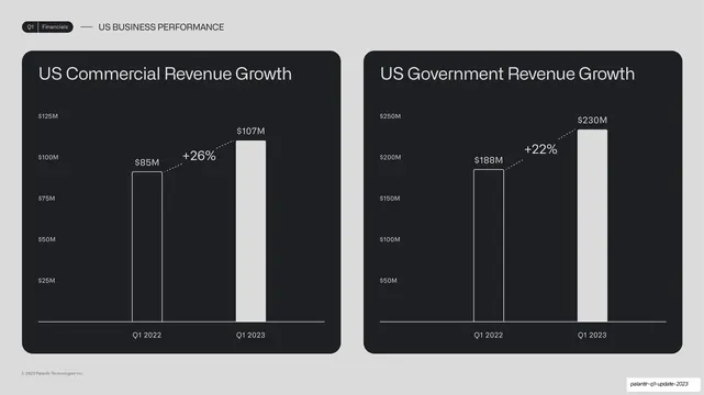
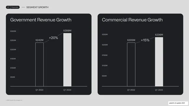
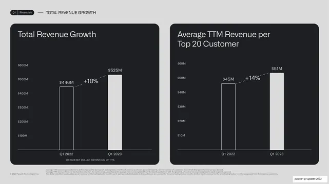
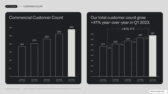
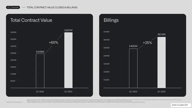
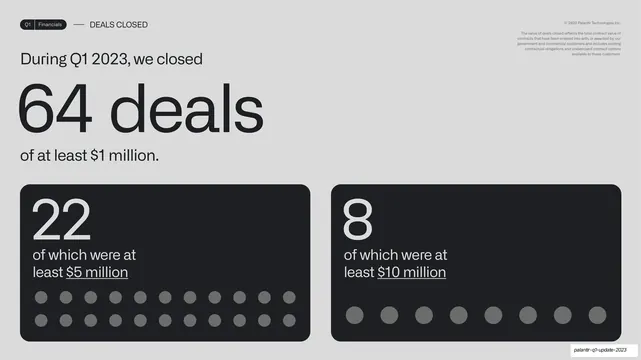
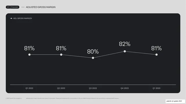
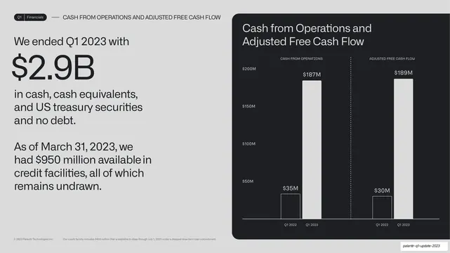
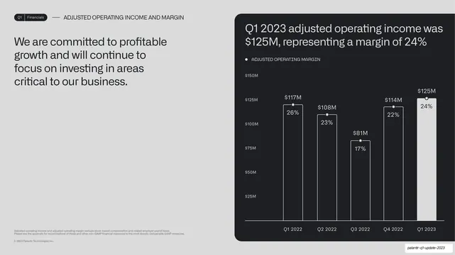
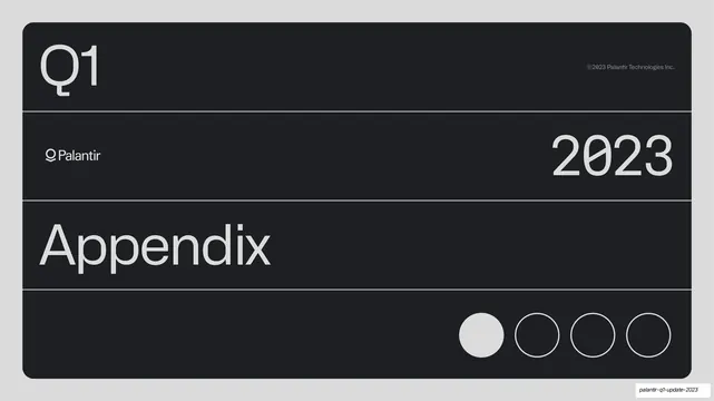
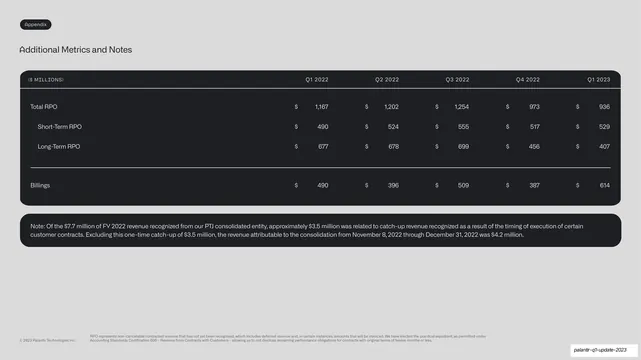
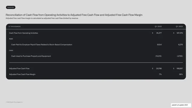
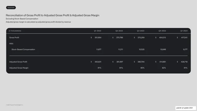
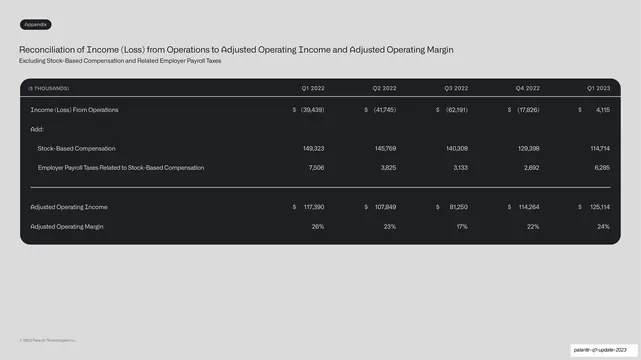
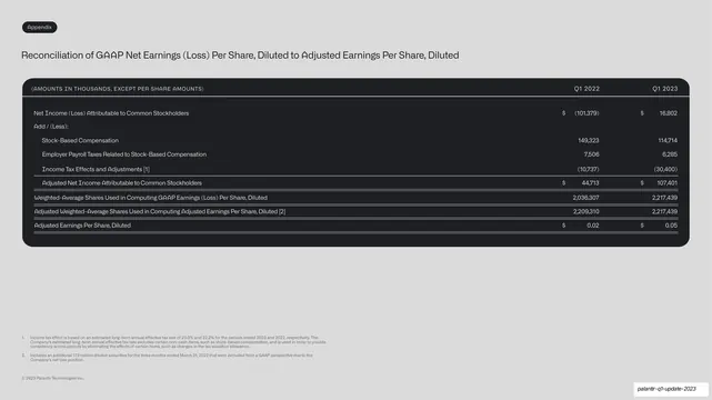
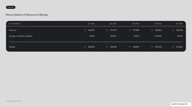
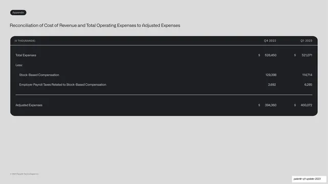
Slides are 16:9 and alternate two surfaces: a light-grey background (~#DDDDDD) holding dark near-black rounded-corner cards, and full near-black panels. Section dividers (Business Update, Financials, Appendix) are a single near-black panel filling the slide, split into horizontal bands by thin hairline rules: an oversized light-grey "Q1" top-left, "2023" set right in a lighter weight, the Palantir leaf logo plus wordmark mid-left, the section name large at lower-left, and a four-dot progress indicator bottom-right with the current dot filled white. Content slides carry a small rounded pill tab top-left ("Q1" plus the section name), an em-dash and an all-caps section label, and "© 2023 Palantir Technologies Inc." top-right. Headlines are a clean grotesque sans (near-Helvetica/Inter); tiny labels, legends, axis units and table headers are uppercase monospace ("($ MILLIONS)", "ADJ. GROSS MARGIN"). Financial slides follow a fixed grammar: a short headline statement on the grey field at left, paired with a chart inside a dark rounded card at right, or two side-by-side dark cards comparing segments. Charts are spare: outlined-vs-filled white bars, white-dot line charts, and dotted connectors labeled with growth percentages (+18%, +60%). Big-number stat slides ($337M, $2.9B, "64 deals") blow the figure up in oversized dark grotesque on the grey field, sometimes with rows of small dot glyphs counting deals. The AIP product section adds a greyscale isometric exploded-layer illustration with a few small red and green status dots, and a circular Foundry/Ontology/LLMs orbit diagram around an "AIP" mark with a faint violet glow. Appendix slides are dense GAAP reconciliation tables inside dark panels with hairline column rules.
Key takeaway
The single repeatable template for a data-heavy deck: dark rounded card on a light field, headline-left / chart-right, monospace only for the tiny labels. The near-monochrome restraint that lets the numbers do the talking, with growth deltas shown as dotted connectors rather than extra color. And the divider system, an oversized "Q1 / year / section" stack with a four-dot progress counter, that paces a long report and tells you where you are.
Reuse notes
A strong reference for earnings decks, investor updates, board reports, and any quarterly business review that has to present a lot of charts and tables and still look composed. The headline-left / chart-in-card layout, the big-number stat slide, and the GAAP-style reconciliation table are directly reusable. The monospace utility labels and the leaf wordmark are Palantir-specific brand cues; swap them for your own. Works best when the data is genuinely the story, the greyscale palette gives almost nothing else to look at.
From this deck: Palantir Q1 2023 Business Update
View deck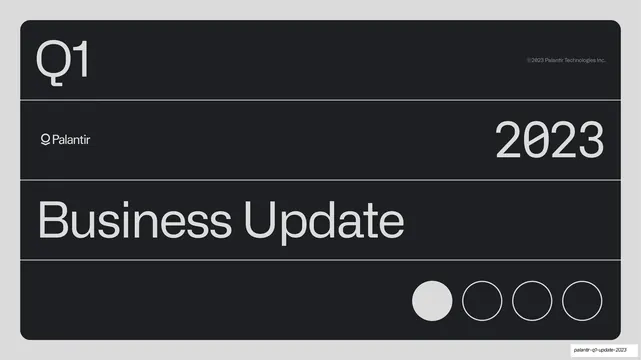


More like this









Keep what you find
A free account saves references to boards and can send you a weekly email of picks based on what you save.
To see every result, go Pro.