
Preview image. Unlock full-res
A 10-slide branding studio process deck on a warm off-white ground that pairs a green geometric sans with a green script display face and a soft retro pastel accent palette.
Summary
A 10-slide capabilities and process deck from Smith & Diction, a branding studio with 13 years of identity work. Its personality comes from a two-typeface system: an upright green geometric sans for working copy and a romantic green (or white) script for every section title, set on a warm putty-grey ground with a soft retro pastel accent palette.
Visual description
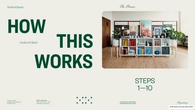
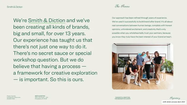
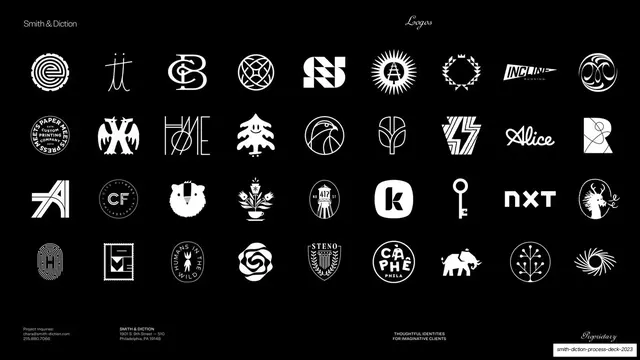
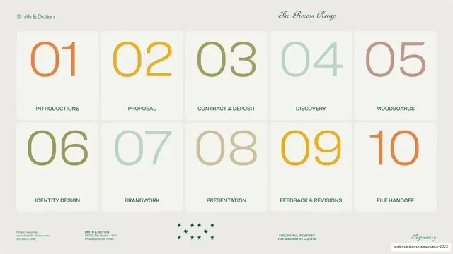
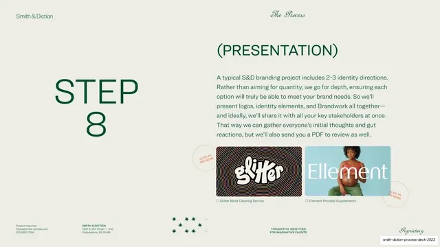
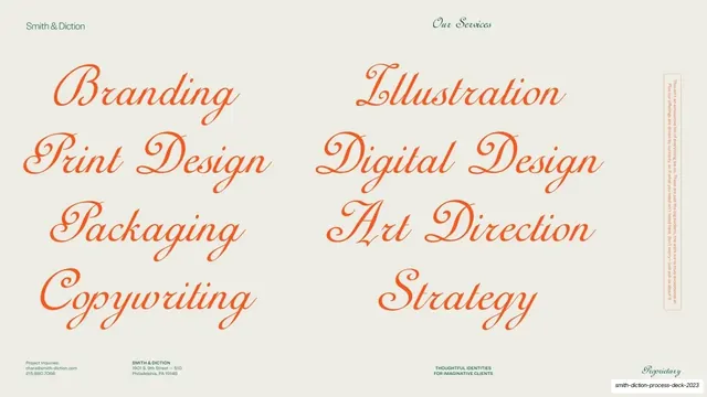
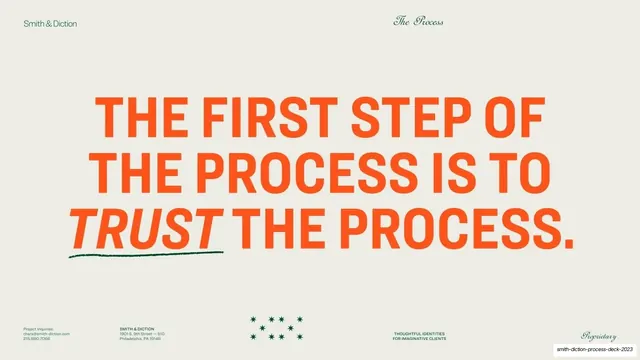
Slides run 16:9 on a warm off-white putty ground (about #EEEDE4); two interior slides invert to near-black. The text color is a deep forest green (about #1F5C3A) used for almost all type, lifted by a muted retro accent set of burnt orange, ochre, sage, dusty teal and rose. Two type voices run throughout: an upright geometric sans (often all-caps, frequently oversized) carries headlines and body copy, while an ornate engraver-style script handles the running section label and the big title slides ("The Process", "Featured Work"). A consistent chrome frames every slide: "Smith & Diction" in sans top-left, a centered or right script section label top-right ("The Process" / "Our Services" / "Logos"), and a four-cell footer in tiny caps (project inquiries and email left, the studio address, the "Thoughtful Identities For Imaginative Clients" tagline, and a script "Proprietary" mark right). Recurring devices: pastel pill-shaped highlight blocks behind key words in running body copy; the same pills reused as a labeled flow diagram (LOGO over COLORS + MESSAGING + TYPE over BRANDWORK over STYLE GUIDE); a 10-card numbered process grid in soft tinted boxes, each number a different pastel; a circular S&D monogram and a small green star/asterisk cluster as spot marks; "click to see more" hand-script circles over case-study thumbnails. Photography is warm and lifestyle-led (a styled studio shelf, the team). The closing slide is an oversized all-caps statement with one word swapped to italic and underlined by a hand-drawn green stroke.
Key takeaway
The disciplined two-typeface pairing: a blunt geometric sans doing all the work while a single ornate script owns every section header, which makes the deck feel both modern and crafted. The pastel highlight pills that do double duty as inline text emphasis and as the nodes of a diagram, so the brand-anatomy graphic reads as the same language as the prose. And the muted retro accent palette that keeps ten differently-colored process cards harmonious instead of noisy.
Reuse notes
A strong reference for branding studio, agency, or creative-service capabilities and onboarding decks, especially any deck that has to explain a multi-step process and show a logo portfolio. The script-header / sans-body system is directly portable; it lives or dies on a genuinely good script face. The numbered process grid and the pill flow diagram are reusable as-is. The warm putty ground and earthy palette read as boutique and editorial rather than corporate; swap to higher contrast if a more techy tone is needed.
From this deck: Smith & Diction Process Deck 2023
View deck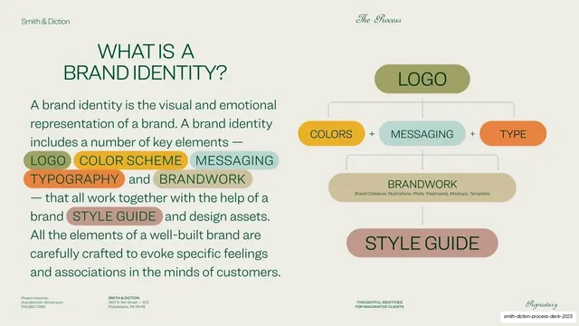
More like this


Keep what you find
A free account saves references to boards and can send you a weekly email of picks based on what you save.
To see every result, go Pro.