Preview image. Unlock full-res
A 20-slide visual-identity studio capabilities deck set on pale mint paper with a black neutral grotesque, a persistent wordmark-and-nav footer, and full-bleed case studies that each adopt the client's own brand world.
Summary
A 20-slide capabilities deck for Emma, a Lisbon-based visual-identity studio. Its identity comes from restraint: pale mint paper, a single black neutral grotesque, a consistent wordmark-and-nav footer, and full-bleed case-study slides that hand the screen entirely over to each client's own brand world.
Visual description
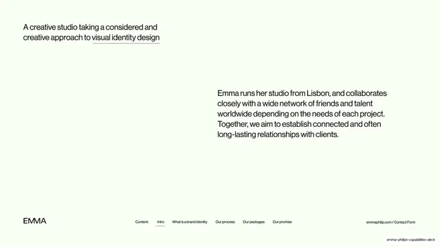
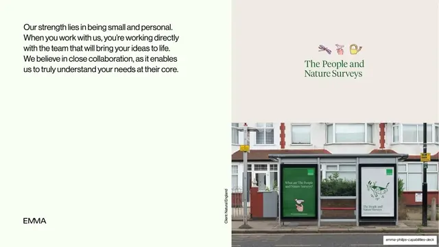
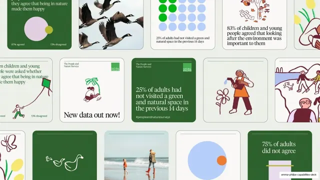
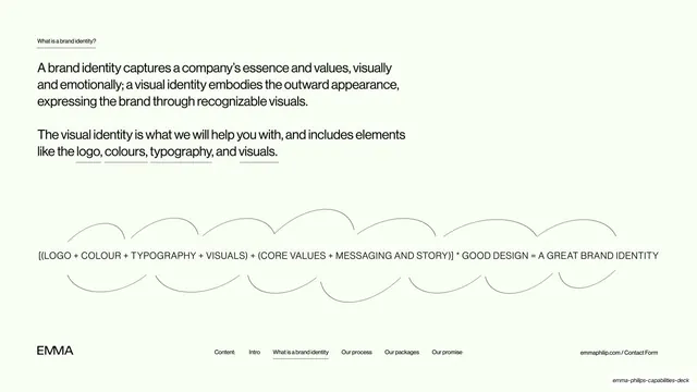
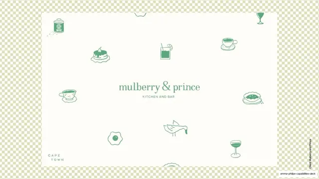
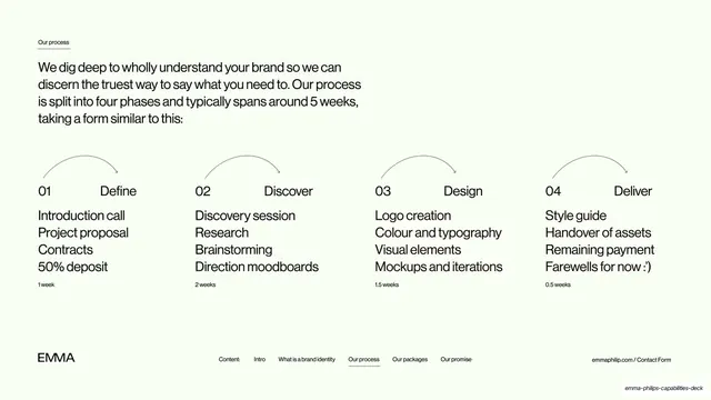
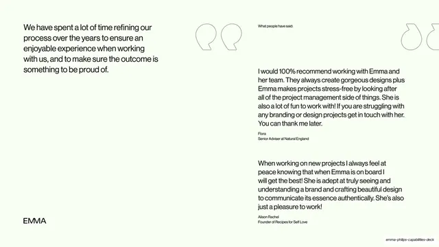
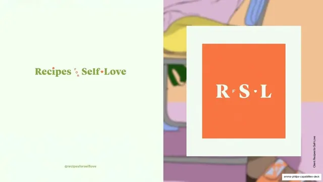
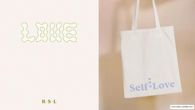
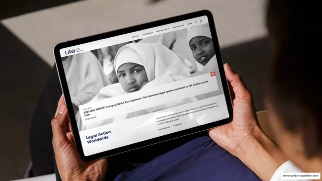
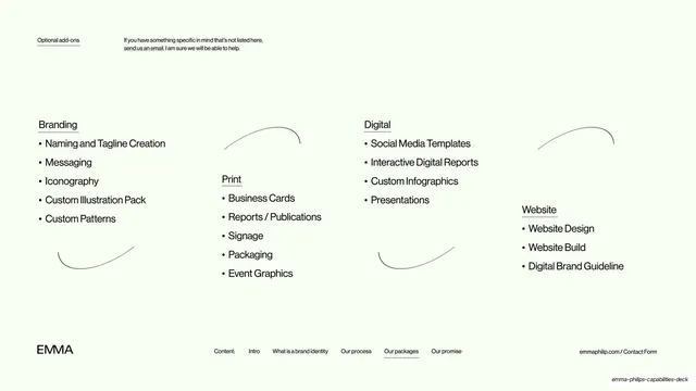
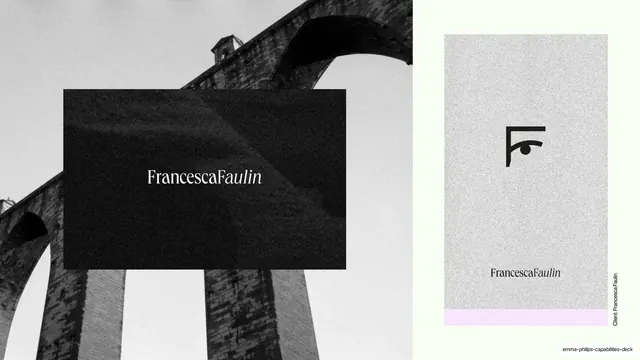
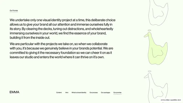
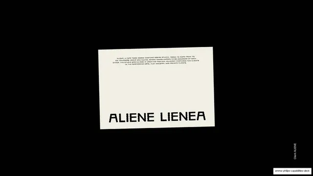
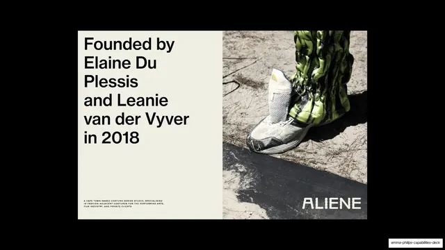
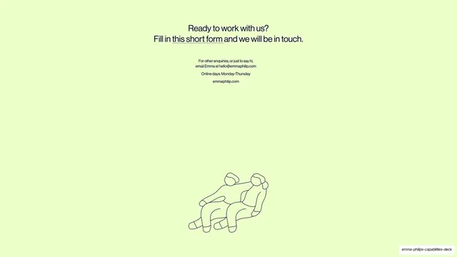
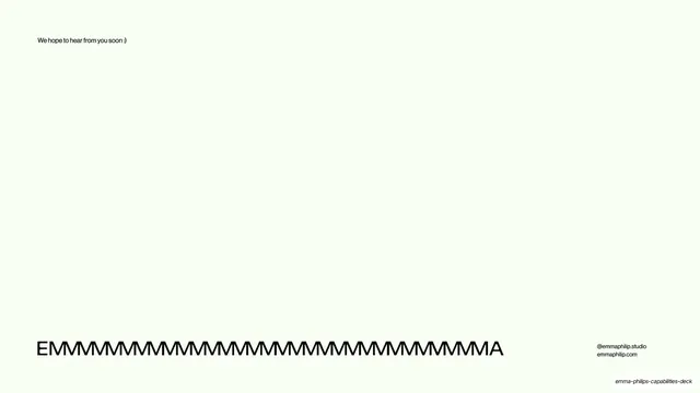
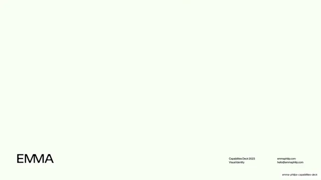
Slides run 16:9 on a near-white pale mint paper (#F4FBEE) with black type set in a neutral grotesque sans; longer client narratives occasionally use a refined serif. The studio's own copy slides carry a fixed footer: the lowercase-cap "EMMA" wordmark bottom-left, a centered horizontal navigation row ("Content:", "Intro", "What is a brand identity", "Our process", "Our packages", "Our promise") with the current section underlined, and a right-aligned utility line ("emmaphilip.com / Contact Form"). Section labels sit top-left as tiny underlined captions, and key nouns inside body paragraphs are underlined inline. Recurring devices: thin hand-drawn line-art figures and animals (geese, seated couple) tucked at the margins, light arc/swoosh hairlines connecting items, and a numbered four-phase process row (01 Define, 02 Discover, 03 Design, 04 Deliver). Case studies break the template: each gets a full-bleed or split layout rendered in the client's own palette and identity, including The People and Nature Surveys (greens, illustrated icons, OOH mockups), Recipes for Self-Love (orange RFSL monogram, lilac merch), Legal Action Worldwide (deep indigo "LAW" lockup, flat illustration, tablet site mockup), Francesca Faulin (black-and-white aqueduct photography, serif logo), and Aliene (black field, distressed display lettering, costume photography). A package/pricing matrix and an optional-services grid round out the offer. The closing slide stretches the wordmark into one long "EMMMMM...A".
Key takeaway
The discipline of building the studio's own slides from almost nothing (paper, one grotesque, a fixed footer) so that each case study can detonate in full color without the deck ever feeling inconsistent. The persistent bottom navigation doubles as a table of contents and a wayfinding spine. Underlining key nouns inline is a quiet way to add hierarchy to plain paragraphs, and the stretched-wordmark sign-off is a memorable closer.
Reuse notes
A strong reference for solo or boutique studio capabilities decks, branding-service pitches, and any portfolio deck that needs to showcase wildly different client identities without a clashing house style. The neutral-paper-plus-one-grotesque container is reusable as-is; the case-study slides depend on genuinely strong client photography and brand assets to carry the full-bleed halves. The persistent footer nav works best in a presenter-paced deck where the audience benefits from constant context.