Preview image. Unlock full-res
A 13-slide design-agency portfolio deck that cycles three flat brand colors (orange-red, golden-yellow, light grey), pairs a serif wordmark with a geometric grotesque, and runs case studies in a fixed split layout.
Summary
A 13-slide capabilities-and-pitch deck from Studio Treble, a design agency that builds pitch decks and brand-led websites. Its identity rests on three flat brand colors used as full-bleed section backgrounds (warm orange-red, golden-yellow, near-white grey), a high-contrast pairing of a chunky serif wordmark with a clean geometric grotesque, and a strict running header/footer system on hairline rules.
Visual description
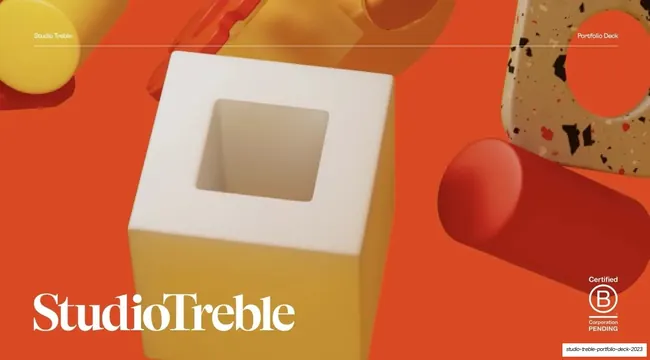
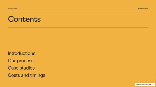
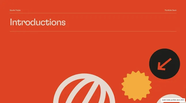
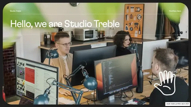
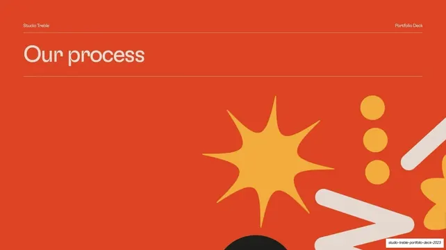
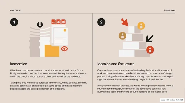
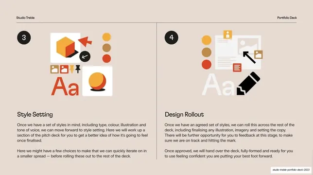
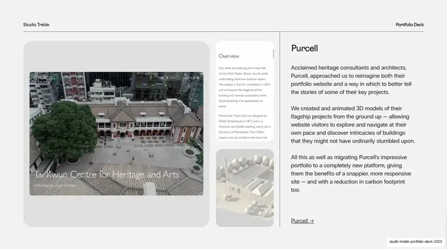
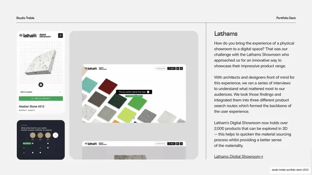
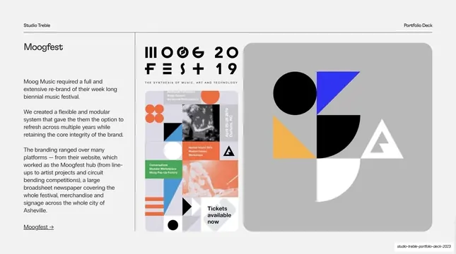
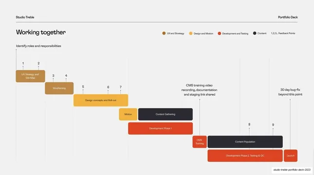
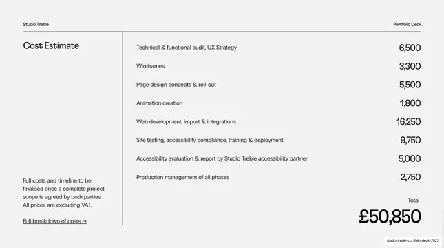
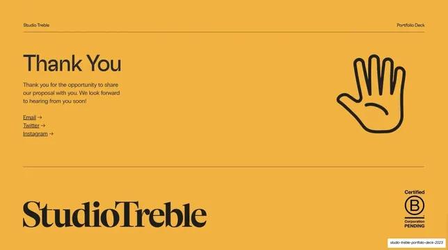
Slides run 16:9. Three background colors rotate to mark sections: a warm orange-red (#E8492A) for the cover and divider slides, a golden-yellow (#EFAE3C) for contents and closing, and a light neutral grey (#F1F1F1) for the case-study and detail slides, with a soft cream-beige (#F2EBDF) on the two-up process slides. Across the top of nearly every slide a hairline rule carries "Studio Treble" at left and "Portfolio Deck" at right; section slides repeat the rule under an oversized headline. Two typefaces do the work: a heavy high-contrast serif for the "StudioTreble" wordmark (cover and thank-you), and a geometric grotesque sans for every headline and body block, set large and left-aligned for titles. Decoration comes from two sources: glossy 3D-rendered toy-like objects and terrazzo shapes on the cover, and flat vector ornaments (starbursts, scribbled balls, dots, a black circle holding a down-left arrow) bleeding in from the lower-right of the divider slides. Recurring layouts: a full-bleed section divider with the title top-left and shapes bottom-right; a two-column numbered process slide (black number disc, flat icon illustration, bold subhead, two short paragraphs); a case-study split with an image stack on the left (a large rounded panel plus smaller stacked thumbnails) and a right column of brand name, three short paragraphs and an underlined arrow link; a horizontal color-coded Gantt timeline; and a right-aligned price list with a large total. A "Certified B Corporation PENDING" stamp sits bottom-right on the cover and closing slides.
Key takeaway
The three-color section system: instead of decoration, the deck paces itself by switching full-bleed background color, so the viewer always knows which section they are in. The serif-wordmark against grotesque-everything-else contrast gives a small agency a distinctive voice cheaply. And the fixed case-study split (image stack left, narrative plus arrow link right) is a clean, repeatable template that keeps multiple projects looking like one system.
Reuse notes
A strong reference for design-studio, agency, or freelance portfolio and pitch decks, especially client-facing proposals that need a process section, case studies, a timeline and a costs page. The case-study split and numbered process slides are directly reusable. The flat starburst/scribble ornaments and the glossy 3D cover render are on-brand for a playful studio; swap them for quieter shapes in a more corporate context. The serif wordmark is bespoke; replace it with your own logotype.