Preview image. Unlock full-res
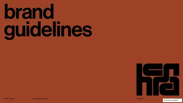
A 97-page brand guideline for hcma, an interdisciplinary design firm, built on alternating terracotta dividers and cream content pages, a custom interlocking logomark, and a disciplined Neue Haas Grotesk and serif type system.
Summary
The complete brand guidelines for hcma, an interdisciplinary architecture and design firm, running 97 pages across a Verbal Identity half and a Visual Identity half. Its whole personality comes from two moves: alternating saturated terracotta section dividers with warm cream content pages, and a custom blocky interlocking logomark that recurs as the anchor of every divider. It is a working manual, dense with rules, examples, and specs, dressed in a restrained Swiss-editorial style.
Visual description
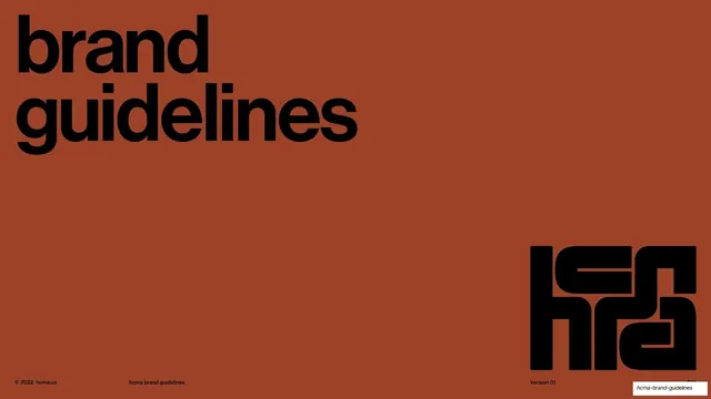
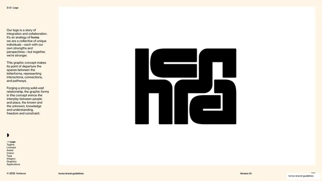
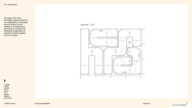
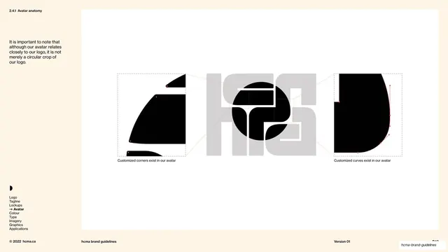
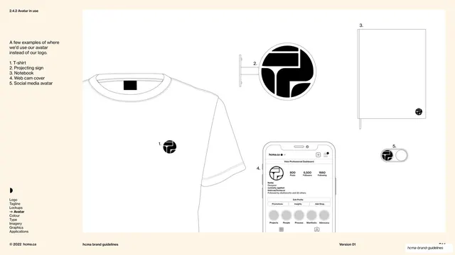
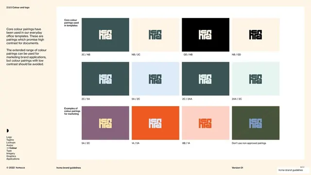
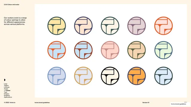
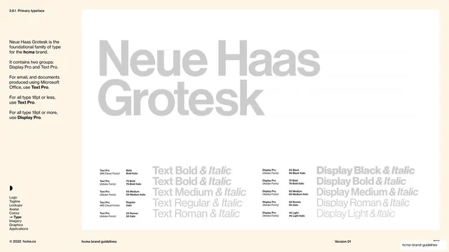
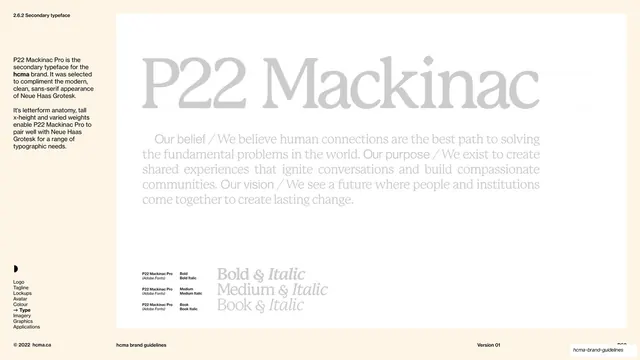
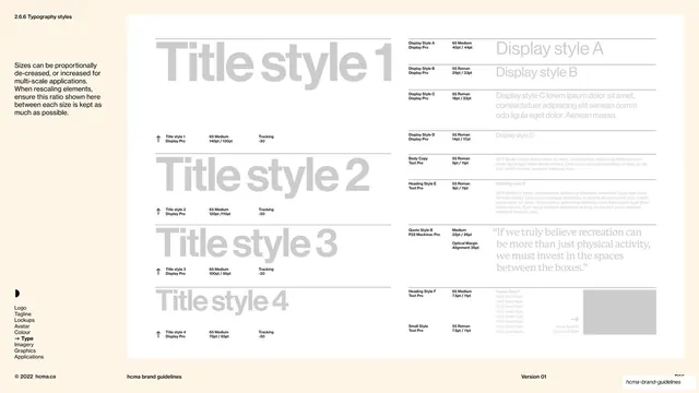
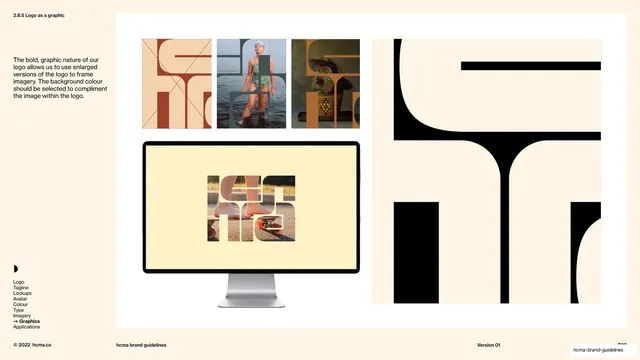
Slides run 16:9. The palette swaps between a saturated terracotta red (#A6422A) for chapter and sub-section dividers, a warm off-white cream (#FAF1E0) for the body of content pages, and inset white (#FFFFFF) panels for showing logos, diagrams, and imagery cleanly; black (#0E0E0E) carries type and the logomark, and sub-sections can take their own palette color (a pale dusty blue #B3CEDA opens the Logo chapter). Two typefaces do nearly all the work: Neue Haas Grotesk, a clean grotesque sans used bold for headlines and small for utility text and rules, and P22 Mackinac Pro, a serif used for statements, definitions, and warm body passages, often with italic emphasis and the bold lowercase "hcma" set inside it. A custom logomark, dense interlocking blocky letterforms reading h-c-m-a with crisp negative-space channels, is the brand's signature graphic and appears large on covers and dividers; a round avatar mark derived from it serves smaller uses.
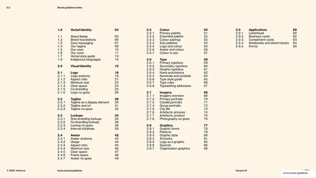
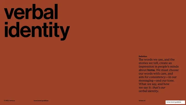
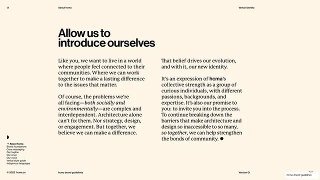
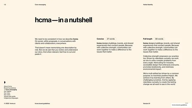
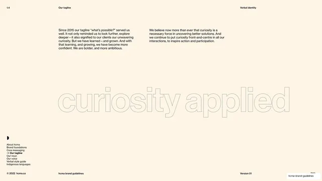
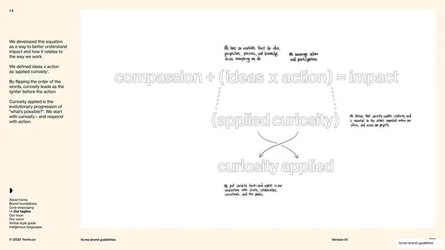
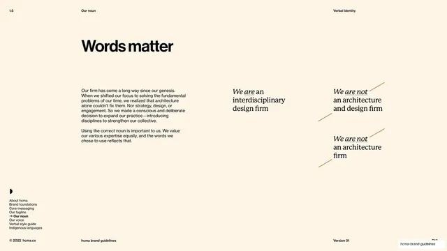
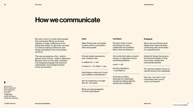
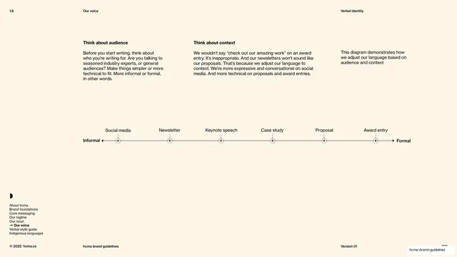
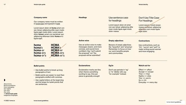
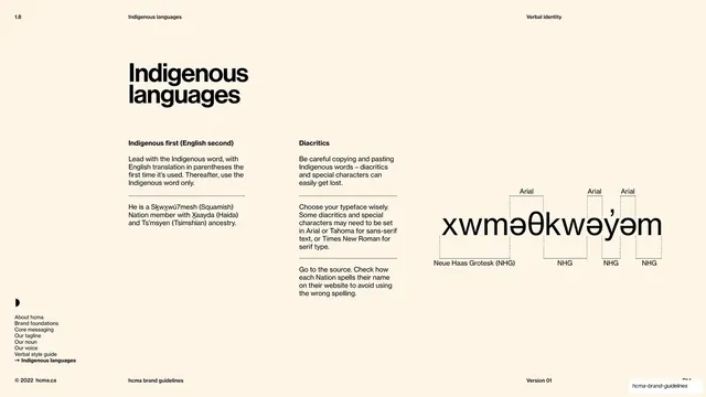
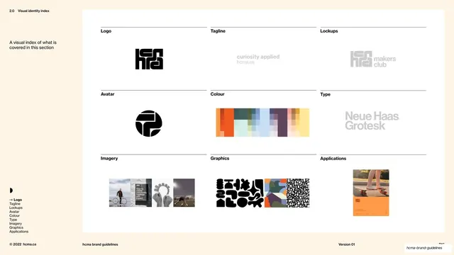
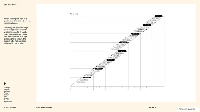
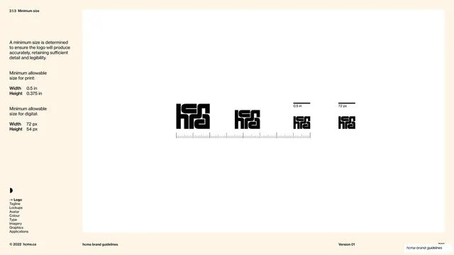
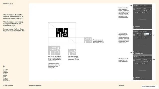
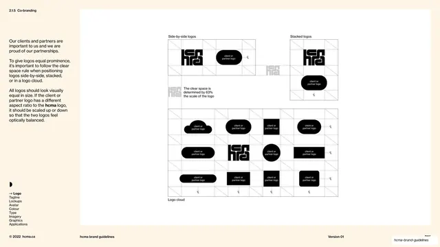
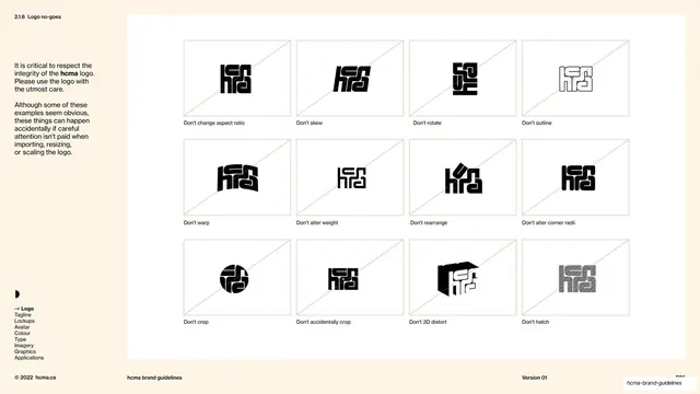
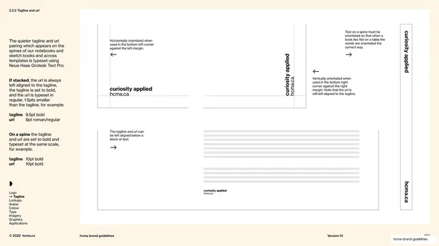
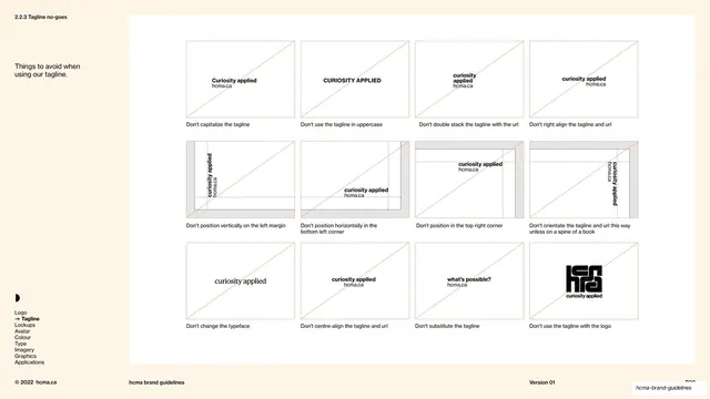
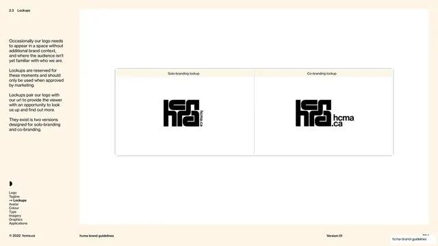
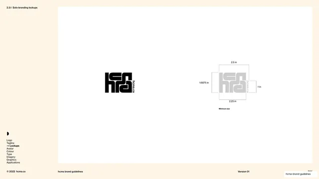
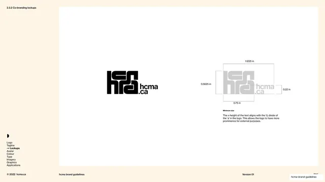
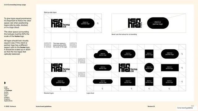
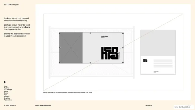
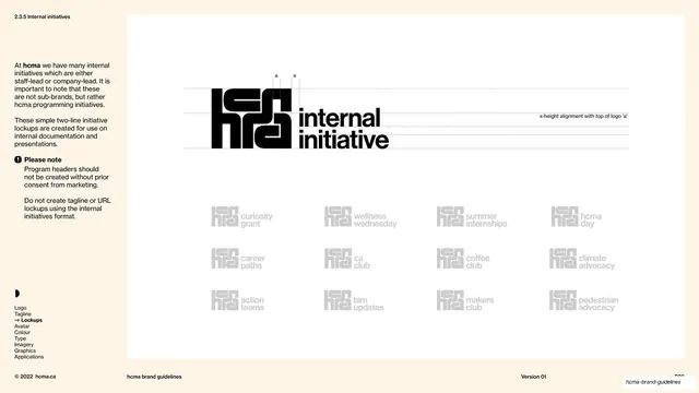
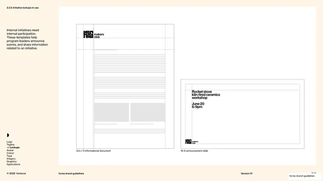
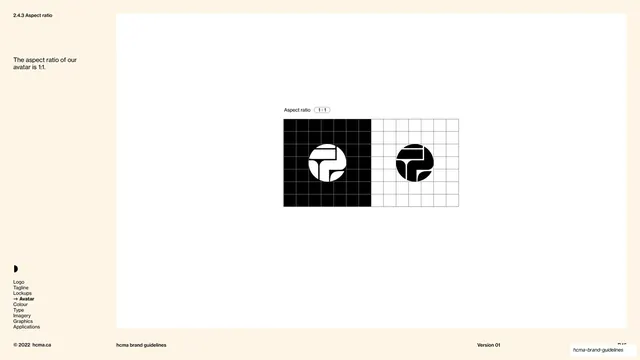
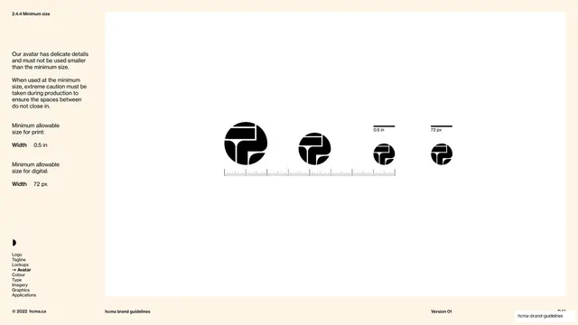
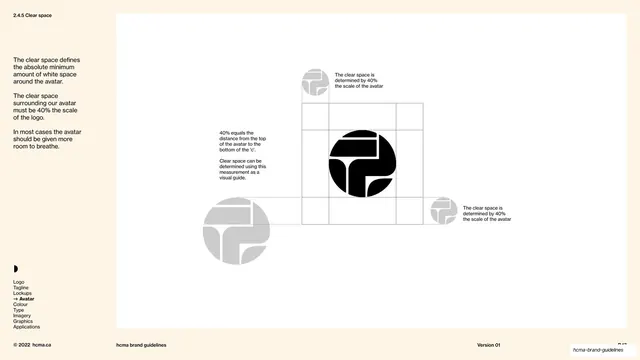
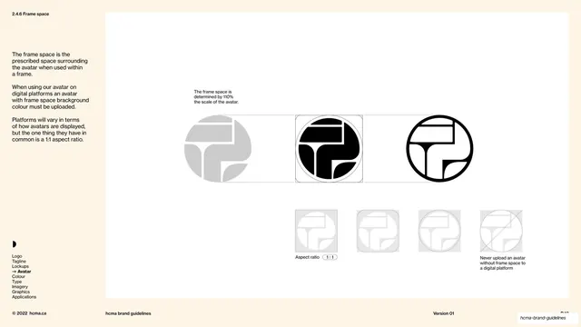
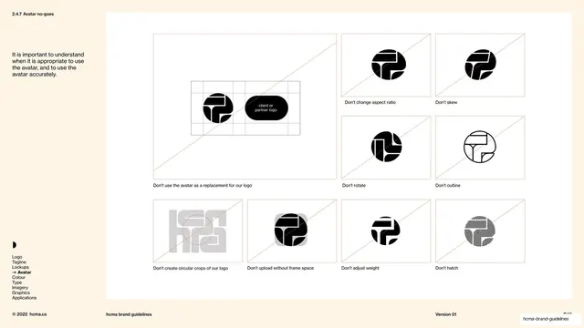
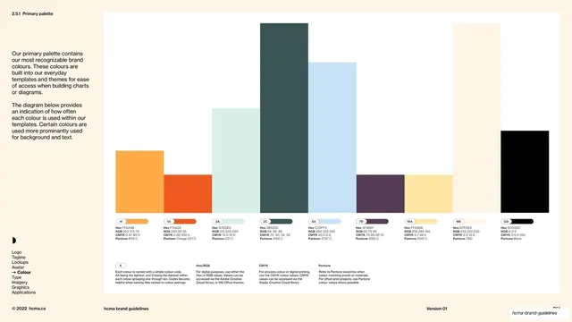
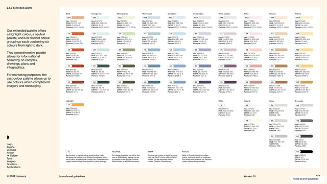
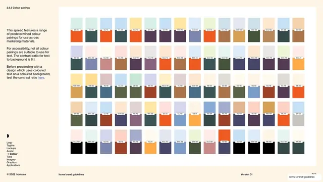
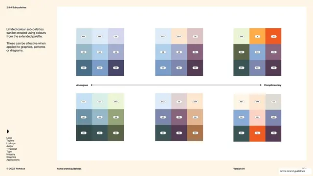
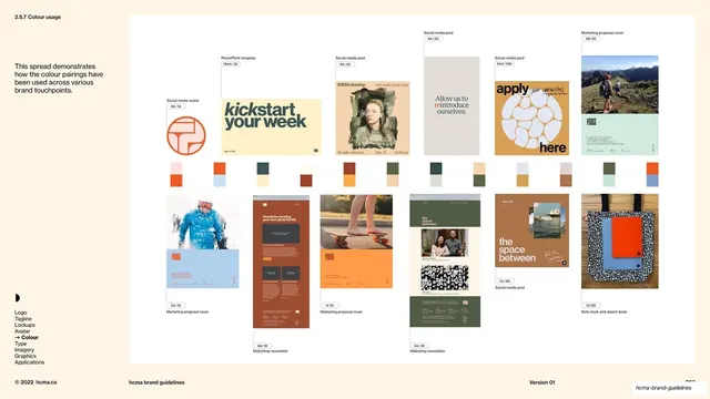
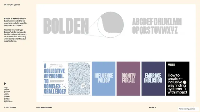
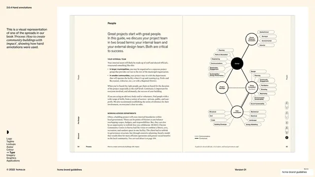
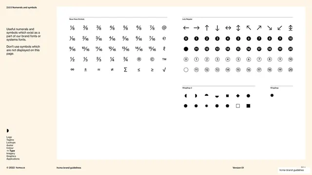
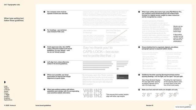
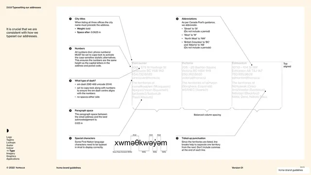
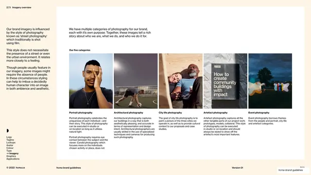
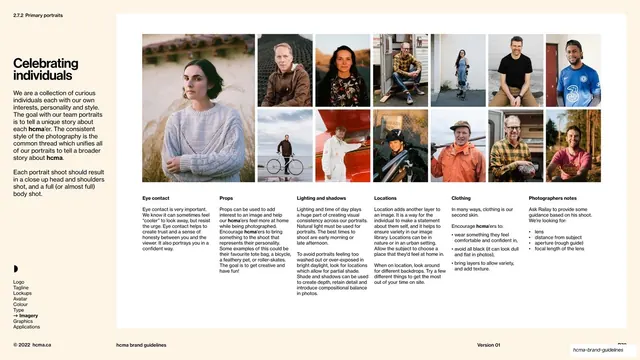
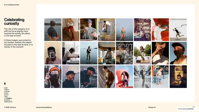
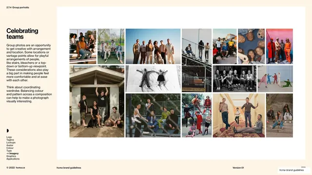
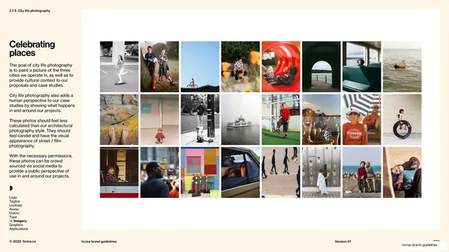
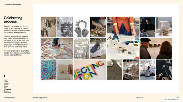
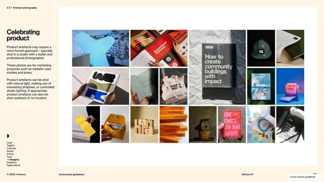
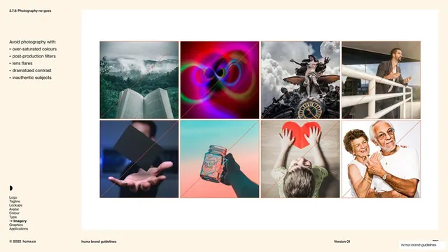
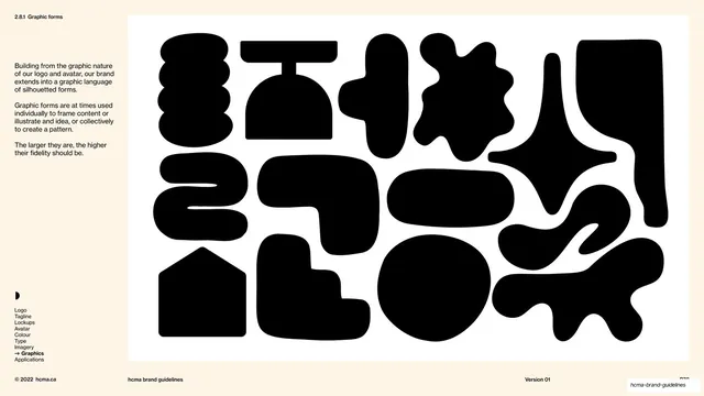
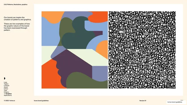
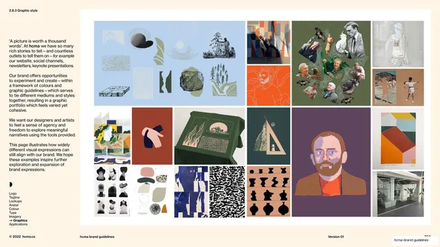
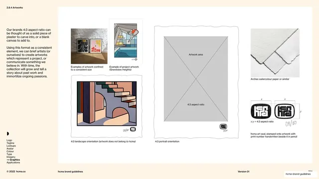
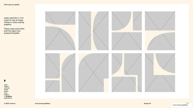
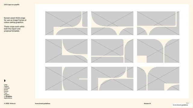
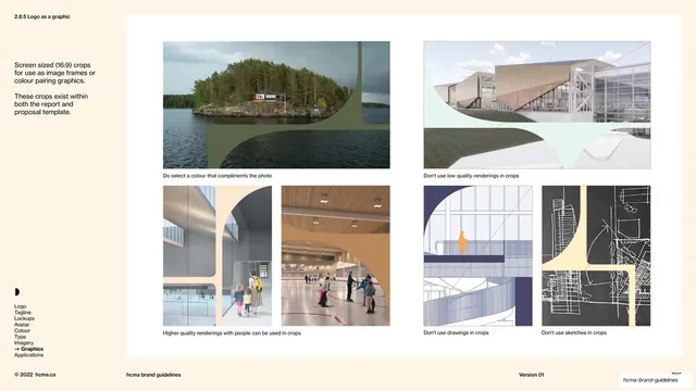
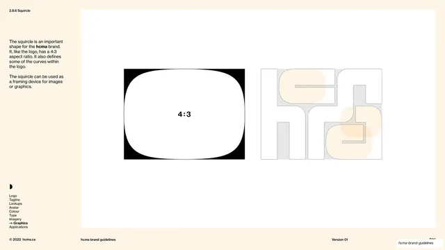
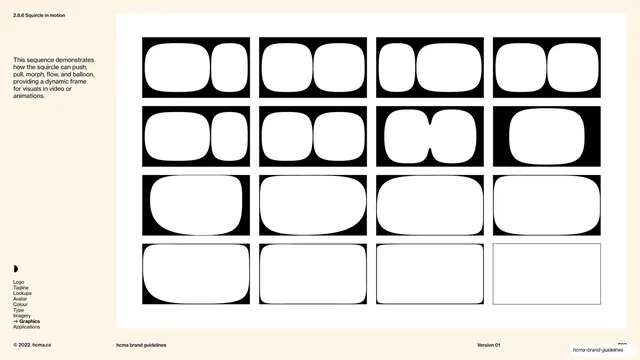
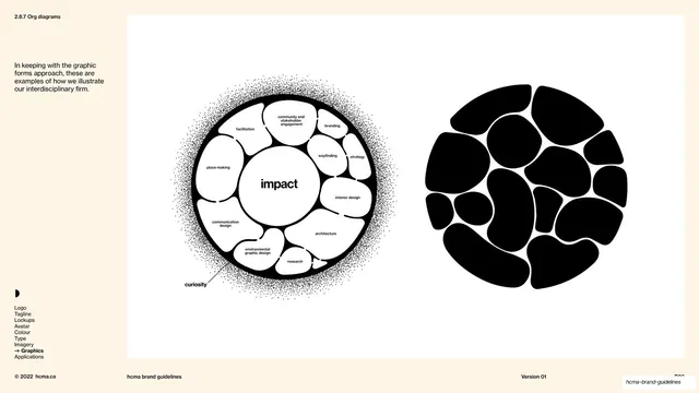
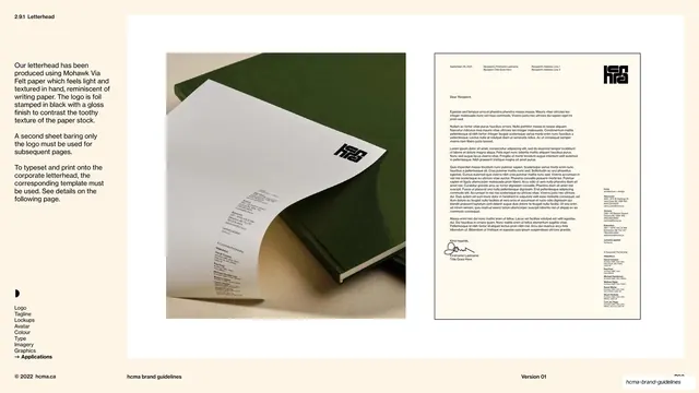
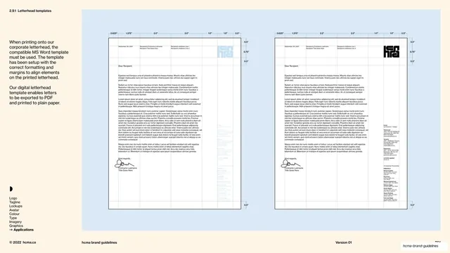
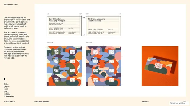
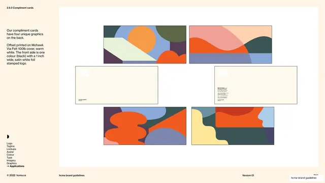
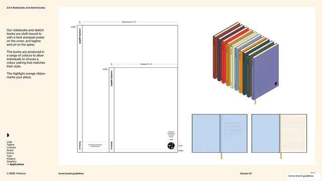
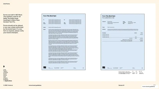
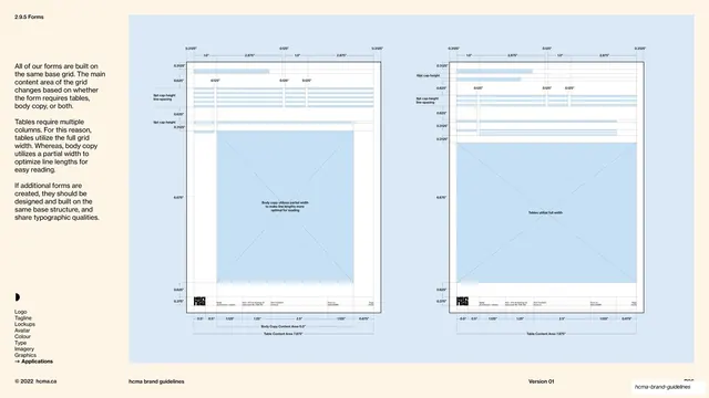
Recurring layout grammar holds the long document together. Every page wears a thin top utility header (decimal section number far left, e.g. "1.6"; section title center-left; chapter name such as "Verbal identity" or "Visual identity" toward the right) and a matching footer rule ("© 2022 hcma.ca" left, "hcma brand guidelines" center-left, "Version 01" and page number right). Content pages carry a persistent lower-left navigation rail, a small half-circle mark above a vertical list of the chapter's sub-sections with the current one arrowed and bold, so the reader always knows their place. Dividers follow one template: an oversized lowercase headline bleeding off the upper-left, with a small bold "Definition" label and serif paragraph tucked into the opposite corner (chapter dividers) or the logomark anchored bottom-right (cover and sub-section dividers). The instructional pages use a recurring kit: multi-column hairline-separated rule grids, do/don't comparisons with wrong options struck through in a thin terracotta diagonal, before/after rewrites in arrow notation, word-count pills on boilerplate, labeled axis and equation diagrams, and large inset white panels for the logo, avatar, colour swatches, type specimens, photography, and graphic shapes. Per the source manifest the deck covers logo construction, aspect ratio, minimum size, clear space, co-branding and lockups, the avatar system, primary and extended colour palettes and pairings, the Neue Haas Grotesk / P22 Mackinac / Bolden type stack, photography categories and no-goes, a graphic-shapes and "squircle" system, and applications (letterhead, business cards, compliment cards, notebooks, forms).
Key takeaway
The alternating terracotta-divider / cream-content rhythm that paces a very long document without decoration and makes chapter changes legible at a glance. The discipline of one custom logomark doing all the heavy lifting, pinned corner-to-corner against an oversized lowercase headline on every divider. The persistent decimal numbering plus lower-left navigation rail that keeps 97 pages navigable. And the consistent instructional language, hairline rule grids, terracotta strikethroughs for don'ts, arrow rewrites, word-count pills, that makes a rules-heavy guide feel like a single coherent tool rather than a stack of unrelated pages.
Reuse notes
A definitive reference for brand and identity guideline decks, especially for architecture, design, agency, or any interdisciplinary practice that wants a warm, editorial, non-corporate manual. The divider template, navigation rail, decimal contents, and do/don't kit are directly reusable for any long design system or brand book. The serif/sans pairing gives warmth that pure-Swiss systems lack; borrow it when a guideline needs to read human as well as precise. The terracotta-and-cream palette and the bespoke interlocking logomark are specific to hcma, swap in your own accent color and mark, but keep the structural grammar. Needs genuinely good photography and a distinctive logomark to carry the visual-identity half.
From this deck: HCMA Brand Guidelines
View deck