Preview image. Unlock full-res
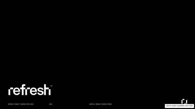
Near-black title slide with the lowercase "refresh" wordmark anchored bottom-left and a monospaced utility footer.
Summary
The title slide: a black field with the lowercase "refresh" logotype set large in the lower-left corner and a thin monospaced footer.
Visual description
A pure black full bleed. In the lower-left, the studio logotype "refresh" is set in a custom lowercase grotesque with squared terminals and a small superscript TM. A single monospaced all-caps utility line runs along the very bottom: "REFRESH STUDIO CAPABILITIES DECK" left, "2024" beside it, and "DIGITAL PRODUCT DESIGN STUDIO" centered. A small two-bar logo glyph sits at the bottom-right. The rest of the frame is empty black.
Key takeaway
Letting a single corner-anchored wordmark plus one line of tiny monospaced metadata carry an entire cover. The contrast of a soft humanist lowercase logo against rigid all-caps mono labels sets the deck's whole tone in one frame.
Reuse notes
A confident, restrained cover for a studio or product-design deck. Works because the negative space is generous and the type is strong; weak if the logotype is generic. The black-with-mono-footer pattern recurs throughout, so it doubles as the deck's system statement.