Preview image. Unlock full-res
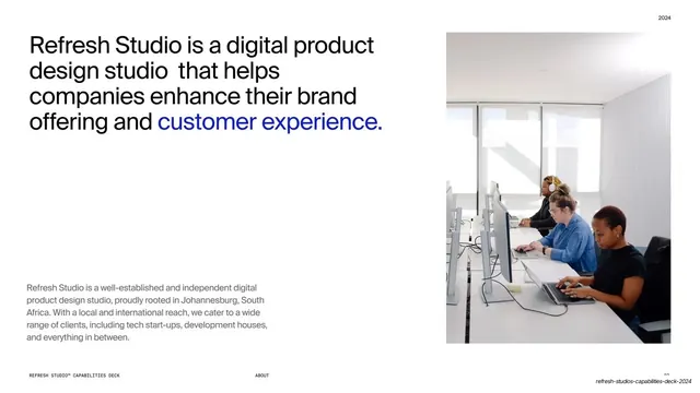
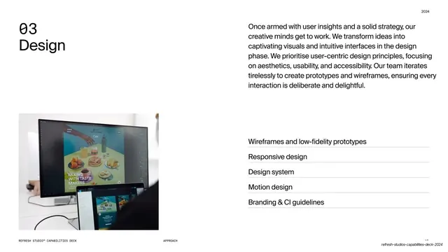
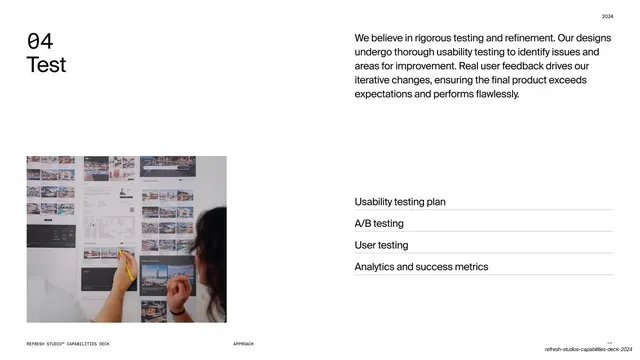
White slide with a workplace photo left and a large headline plus a two-column grid of six short value statements right.
Summary
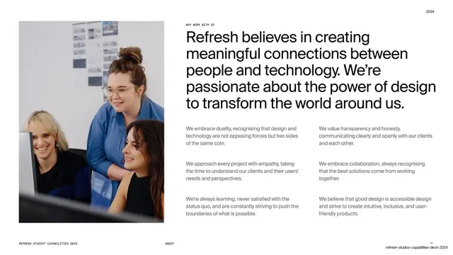
A "why work with us" values slide: a candid team photo at left, a big mission headline at right above a two-column grid of six short value blurbs.
Visual description
A white slide. The left third holds a candid colour photo of three smiling colleagues clustered at a screen. The right two-thirds open with a small mono eyebrow, "WHY WORK WITH US", over a large black grotesque headline about creating meaningful connections between people and technology. Below, six short grey paragraphs sit in a two-column, three-row grid, each one a value (embracing duality, transparency, empathy, collaboration, continuous learning, accessible design). A monospaced footer with "ABOUT" centered runs along the bottom.
Key takeaway
Stacking a large mission headline directly over a tidy two-by-three grid of short value statements. The grid keeps six points scannable and visually even without bullets, while the candid photo warms up an otherwise type-led slide.
Reuse notes
A reusable "our values" or "why us" layout. The headline-over-grid structure scales to four or six items cleanly. Use a warm, human candid for the image to offset the cool grotesque type. Keep each value blurb to two or three lines so the grid stays balanced.