Preview image. Unlock full-res
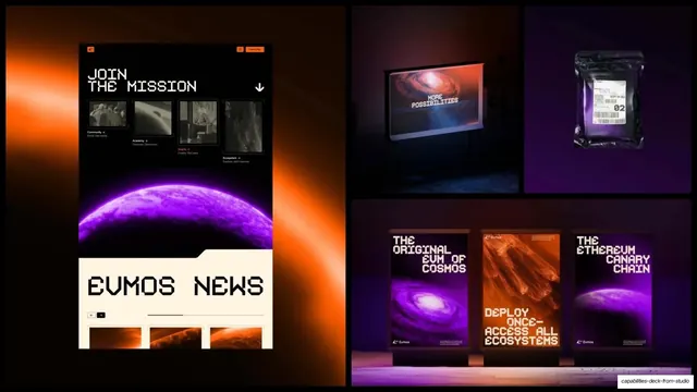
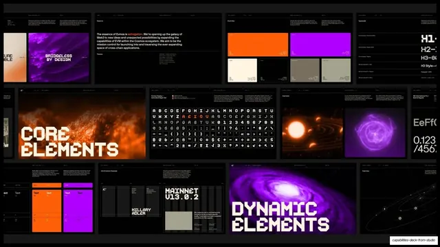
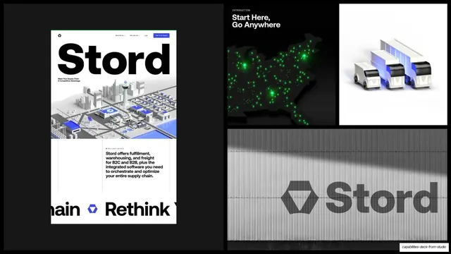
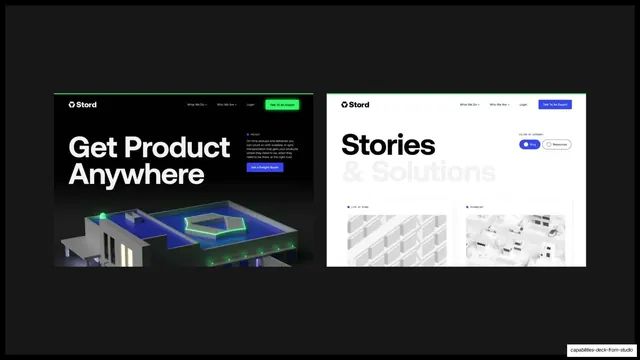
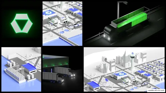
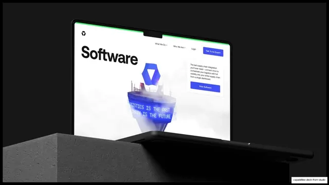
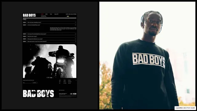
A 55-slide dark capabilities deck from Studio Freight built on a strict black grid, a fixed utility header, and oversized sans-plus-serif-italic headlines, with full-bleed case-study imagery for Easol, Republic, Lunchbox, Evmos, Stord and Bad Boys.
Summary
A long, confident capabilities deck for Studio Freight, an independent creative studio. Its personality comes from three moves: an almost entirely black canvas, a fixed monospace utility header that frames every text slide, and oversized headlines that pair a bold sans with a contrasting serif italic. Case studies then break to loud full-bleed imagery.
Visual description
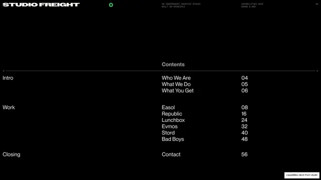
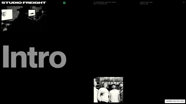
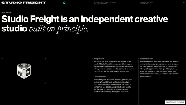
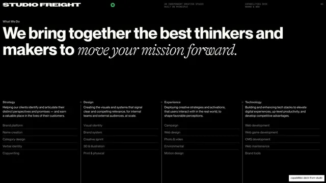
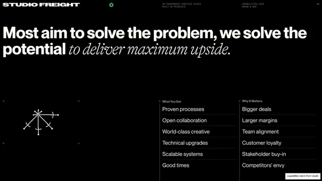
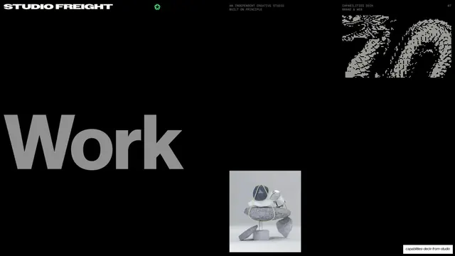
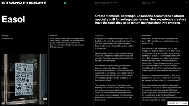
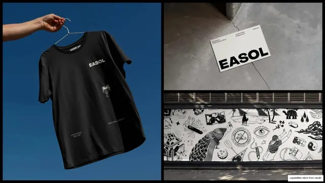
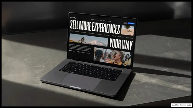
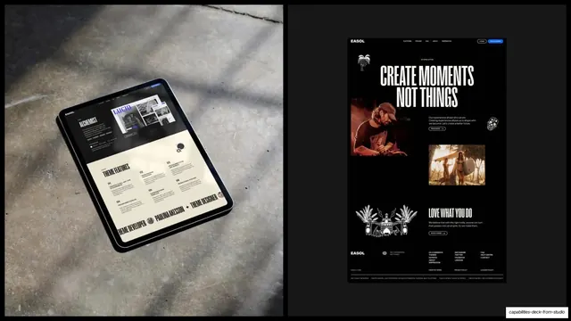
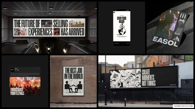
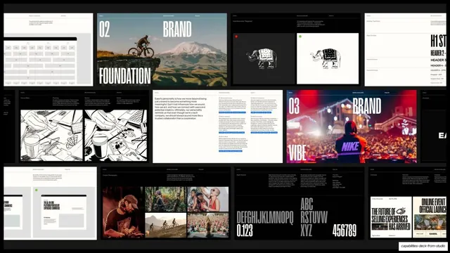
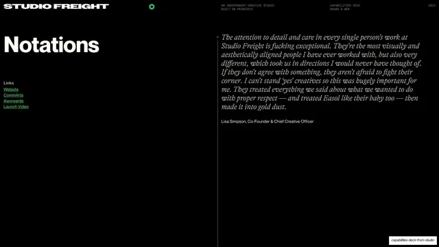
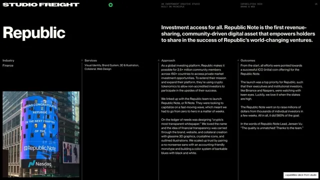
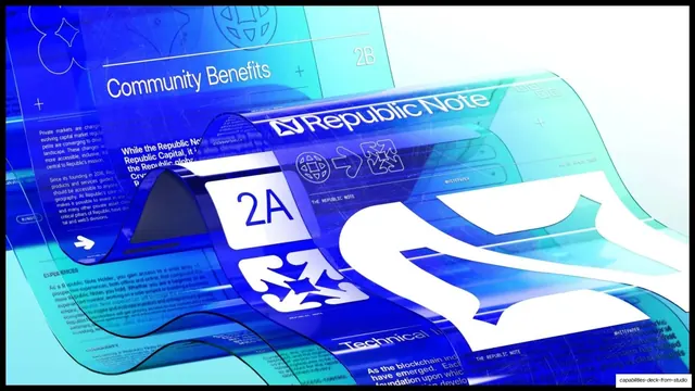
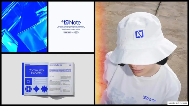
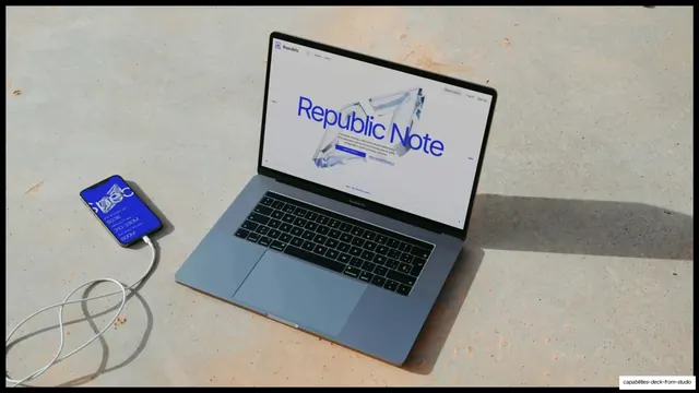
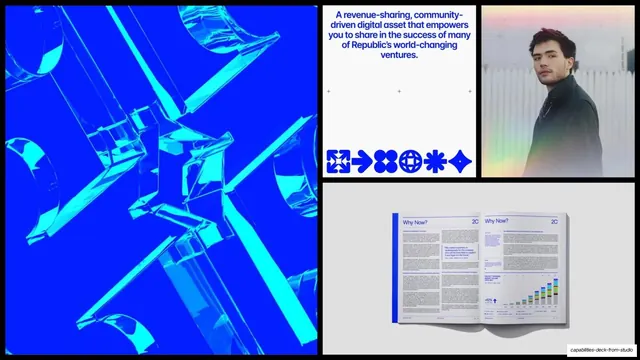
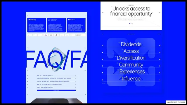
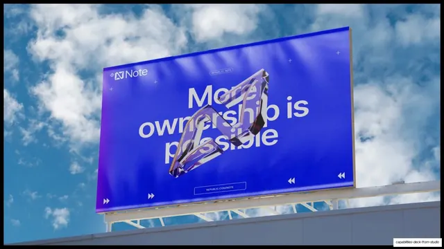
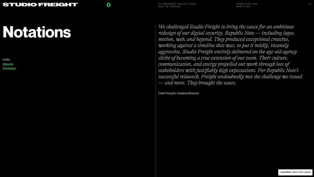
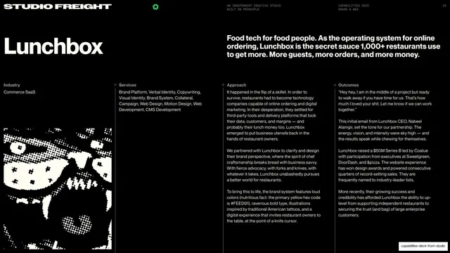
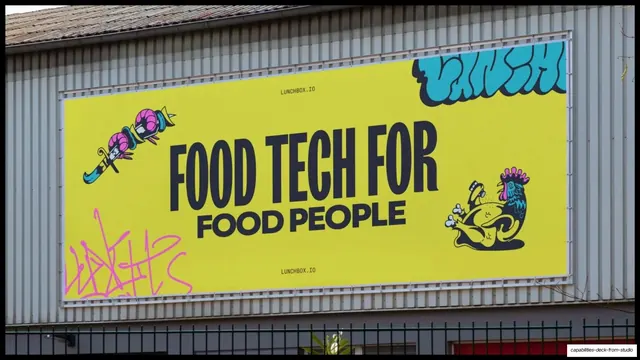
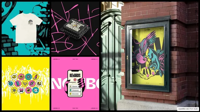
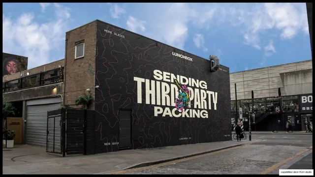
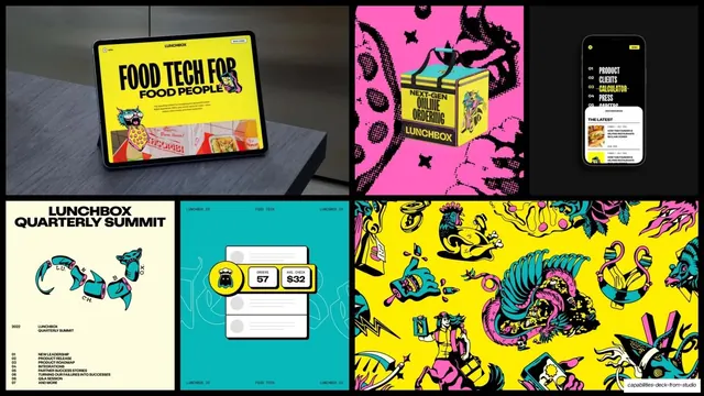
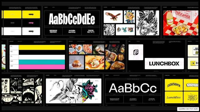
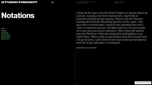
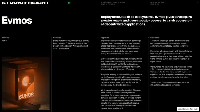
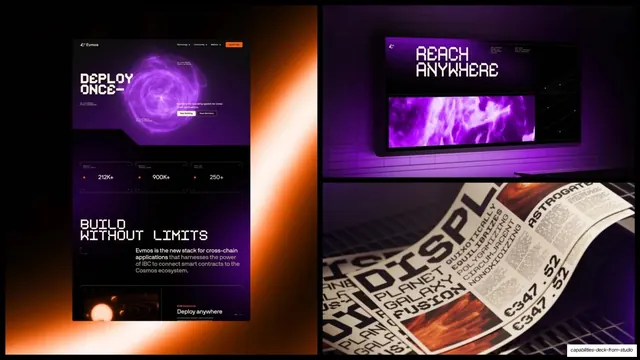
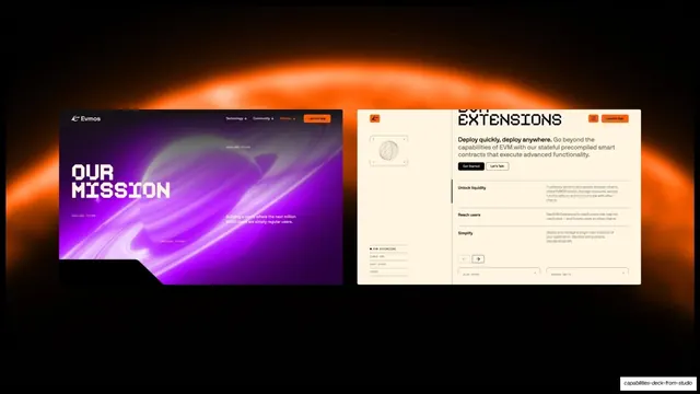
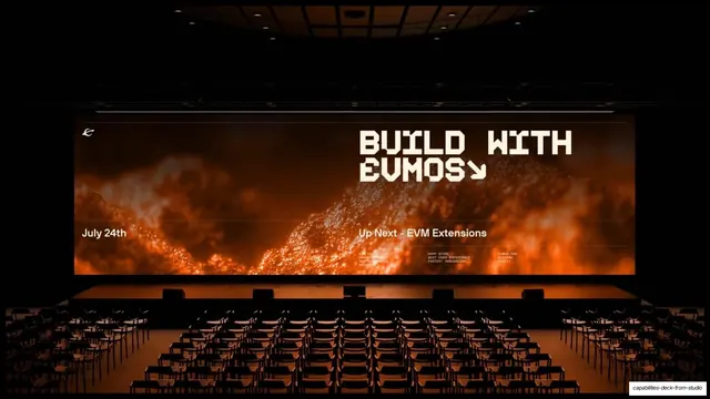
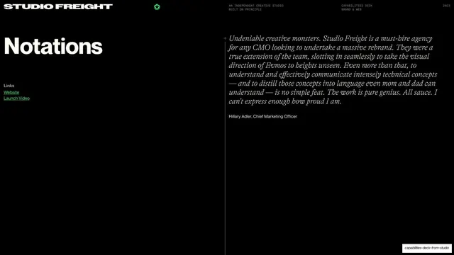
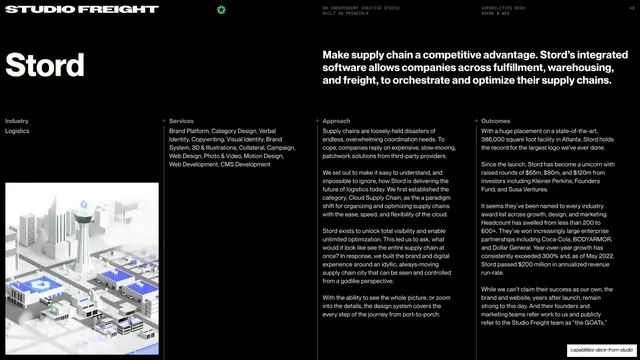
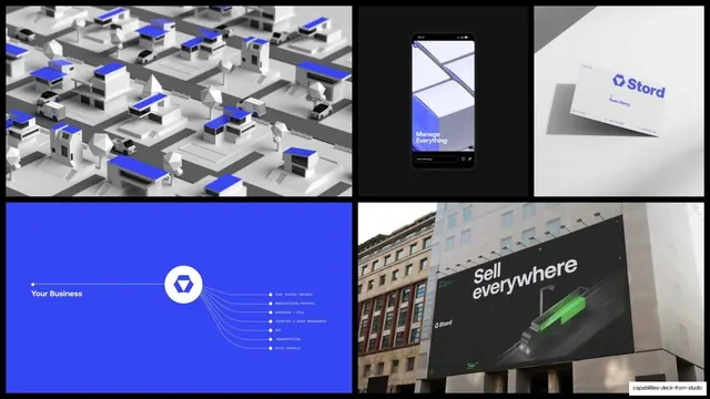
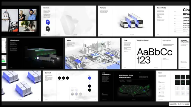
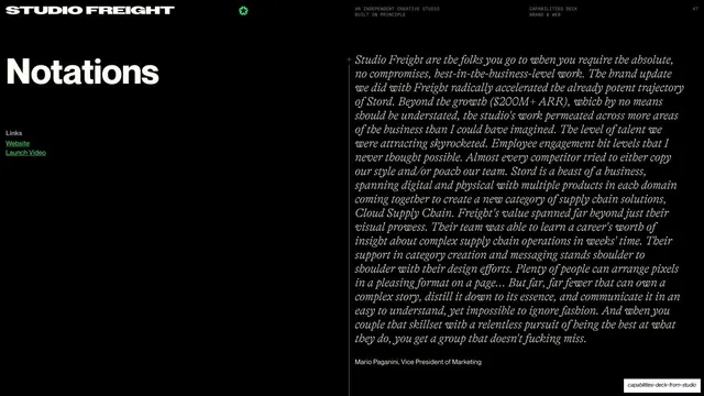
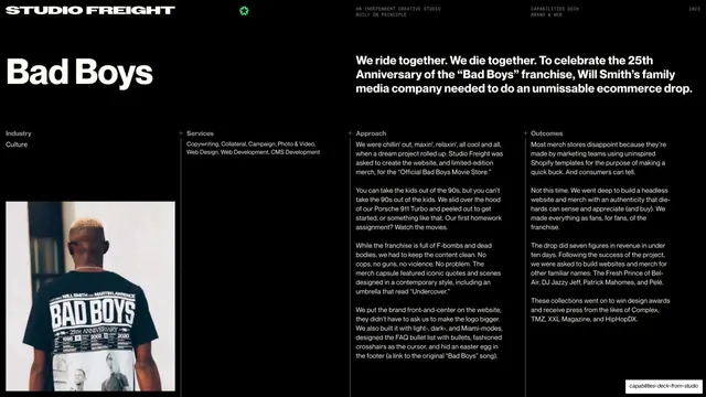
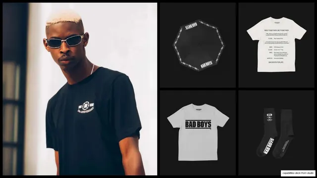
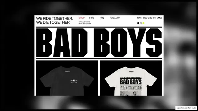
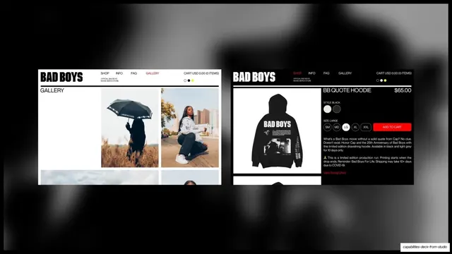
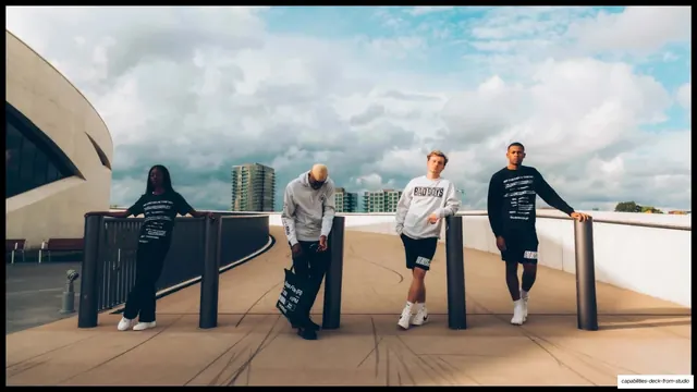
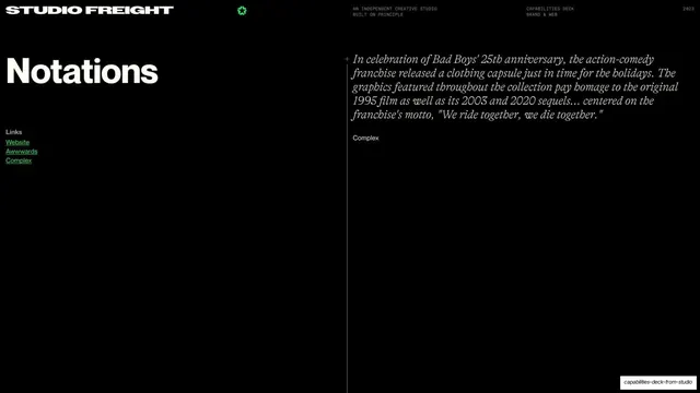
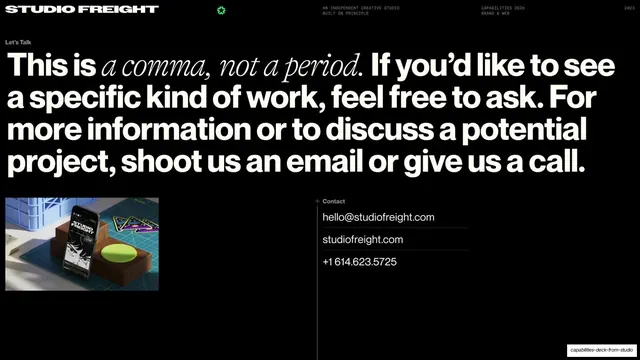
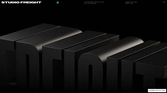
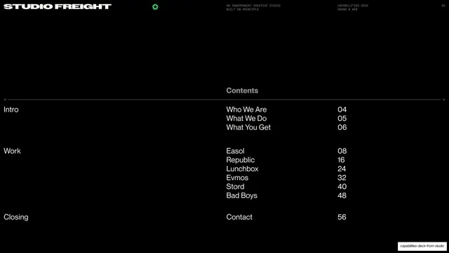
Slides run 16:9 and are overwhelmingly black with white type and a single bright green accent (a small starburst glyph, plus the live links). The recurring text-slide chrome is consistent: a condensed extra-bold "STUDIO FREIGHT" logotype top-left, the green starburst beside it, a two-line monospace block center ("AN INDEPENDENT CREATIVE STUDIO / BUILT ON PRINCIPLE") and right ("CAPABILITIES DECK / BRAND & WEB"), and a tiny page number in the top-right corner, all sitting above the content. Headlines are set very large and mix a bold neo-grotesque sans with a serif italic on the emphasized phrase ("Studio Freight is an independent creative studio built on principle."). Body content sits in a lower band of three or four columns separated by thin hairline rules, each column titled in small bold caps, with small plus-mark crop corners marking the grid. Section dividers drop a single huge mid-gray word ("Intro", "Work") low on the page next to small black-and-white photos and occasional halftone or ASCII-art imagery. Case-study openers use a different grammar: a large serif client name set big on the left, a bold statement headline top-right, an Industry / Services / Approach / Outcomes column set, and a full-bleed photo anchored bottom-left. These are followed by full-bleed montage slides, dense multi-image grids of product mockups, black-and-white line illustration, out-of-home boards, merch and 3D crystalline renders, each case study carrying its own client color (Easol black-and-white, Republic electric blue). A "Notations" testimonial slide sets a long serif-italic client quote on the right against a green link list on the left.
Key takeaway
The fixed monospace utility header that turns every slide into a consistent "document", giving a sprawling deck order without decoration. The headline system of one bold sans phrase resolving into a serif italic, which adds editorial warmth to an otherwise technical black grid. And the rhythm of pacing dense, hairline-ruled text slides against full-bleed image montages so the deck never tires the eye.
Reuse notes
A strong reference for agency, studio and B2B capabilities or sales decks that need to stay legible across 50-plus slides while showing a lot of work. The case-study template (serif client name, statement headline, Industry/Services/Approach/Outcomes columns, full-bleed hero, then a montage grid) is directly reusable. It leans heavily on genuinely good photography, mockups and brand assets to carry the image halves, and the all-black system only works if your imagery can hold contrast against it. The condensed logotype and green starburst are bespoke to Studio Freight; swap them for your own marks.
From this deck: Studio Freight Capabilities Deck
View deck