Preview image. Unlock full-res
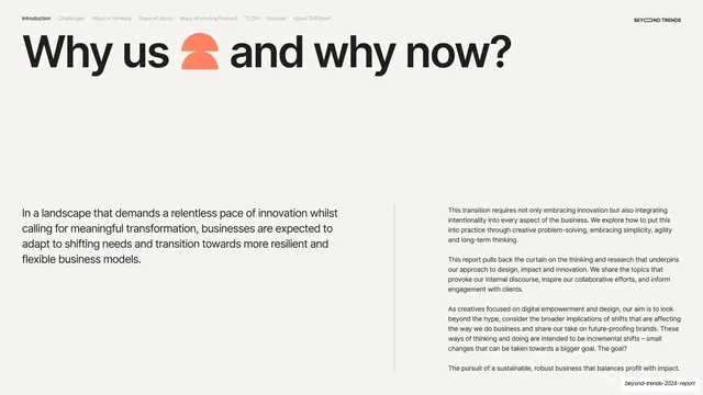
Cream intro slide with an oversized "Why us and why now?" headline and a two-column body split below it by a vertical hairline rule.
Summary
The opening editorial slide: a large "Why us and why now?" headline over a two-column body explaining the report's purpose, divided by a thin vertical rule.
Visual description
Warm cream (#F2F0EB) full bleed. The persistent section-tab nav runs across the top (Introduction active and bold) with the "BEYOND TRENDS" wordmark top-right. A large black sentence-case headline, "Why us and why now?", spans the upper area with a coral half-circle glyph dropped between "us" and "and". The lower half is a two-zone band: a short lead paragraph in mid-size black type on the left, and a thin vertical hairline rule separating a denser right column of three small body paragraphs. Generous empty space sits between the headline and the text band.
Key takeaway
The headline-then-two-column-body grammar with a single vertical hairline as the only divider, and the deliberate gap of whitespace between the oversized headline and the small running text below it. One inline glyph keeps the plain headline from feeling austere.
Reuse notes
A clean template for a report's opening or section-intro page where a short thesis sits beside a longer explanation. Works for any text-heavy editorial slide that needs hierarchy without rules or boxes. Depends on disciplined type sizing between the lead and body columns.