Preview image. Unlock full-res
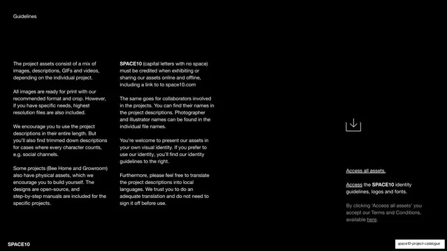
A black guidelines slide with two columns of body copy on the left, an inline downward arrow icon, and access links on the right.
Summary
A black "Guidelines" slide explaining asset formats, credit requirements, and collaborator naming, with download and identity-access links pulled out to the right.
Visual description
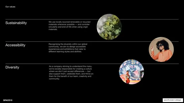
A pure-black slide with a "Guidelines" label top-left. Two columns of small white body copy fill the left and center, covering asset formats, print readiness, credit requirements (with "SPACE10" bolded), and translation permissions. A thin outlined downward-arrow icon sits in the right third, above three underlined access links ("Access all assets", "Access the SPACE10 identity guidelines, logos and fonts", and a greyed Terms line). "SPACE10" anchors bottom-left.
Key takeaway
Splitting dense guideline copy into two readable columns and isolating the actionable links in a third column led by a single download arrow. The arrow gives a text-heavy slide one clear focal point and call to action.
Reuse notes
A practical layout for terms, usage rules, or licensing slides where the copy is unavoidably long. The pulled-out link column keeps the "what to do next" obvious. Use a single icon as the only graphic so the slide stays calm.
From this deck: Guidelines for using the assets
View deck













More like this



Keep what you find
A free account saves references to boards and can send you a weekly email of picks based on what you save.
To see every result, go Pro.