Preview image. Unlock full-res
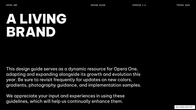
Black intro page with an oversized all-caps "A LIVING BRAND" headline and two paragraphs of body copy below.
Summary
An opening statement page framing the guide as a living, evolving resource, led by a two-line oversized all-caps headline.
Visual description
Pure-black background with the standard monospace header (OPERA ONE / DESIGN GUIDE / VERSION 1.2 / ©OPERA 2023) on a hairline rule. Top-left holds an oversized two-line all-caps headline, "A LIVING / BRAND", in white Be Vietnam Pro black weight. The lower-left third carries two short paragraphs of white sans-serif body copy explaining that the guide adapts and expands and inviting feedback. The right half is empty black.
Key takeaway
The split between a huge top-left headline and a small low-left body block, leaving the right side as breathing room. It paces a guideline deck calmly without any decoration.
Reuse notes
A reusable intro or manifesto layout for any guideline or report. Works on the strength of the type contrast alone, so it needs a genuinely large headline against tight body copy.