
Preview image. Unlock full-res
Cream slide with a lowercase headline left and a tidy three-column grid of monochrome client logos right.
Summary
The social-proof slide: "Design change makers!" headline beside a three-column grid of client logos.
Visual description
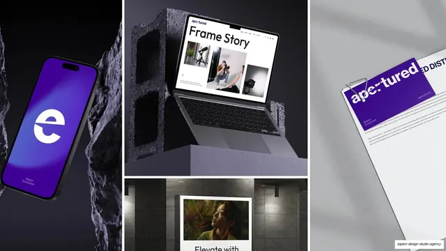
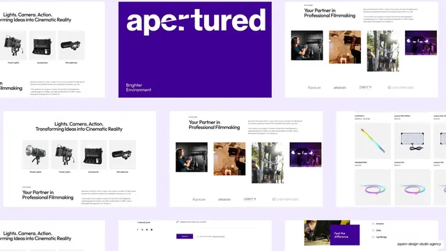
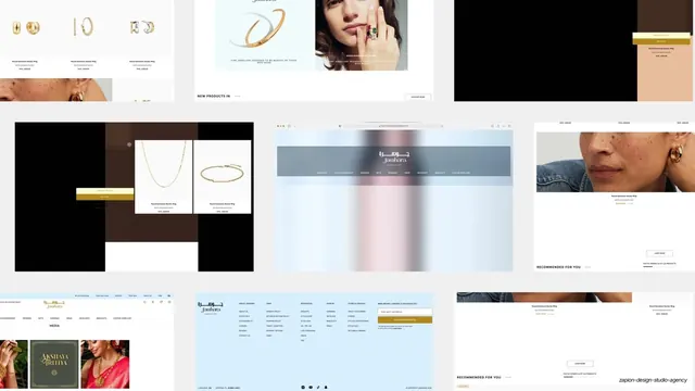
Warm cream background, "DESIGN CHANGE MAKERS" header label. Left half: a two-line lowercase headline with a short all-caps subhead noting growth work for startups, scale-ups, and Fortune 500 brands. Right half: a roughly 3-by-3 grid of monochrome client wordmarks (Jawhara, Aputure, ELS, Apertured, iWorkX, KandyPens, Deity and others), all rendered in the same dark ink so none dominates.
Key takeaway
Flattening every client logo to a single ink color so the wall reads as one calm system instead of a clash of brand colors. Pairing it with a big headline keeps it from feeling like a bare logo dump.
Reuse notes
Standard trust-building slide for agency and B2B decks. The monochrome treatment is the key move; reach for it whenever logos vary wildly in color and weight.
From this deck: Design change makers (client logo wall)
View deck













More like this






Keep what you find
A free account saves references to boards and can send you a weekly email of picks based on what you save.
To see every result, go Pro.