Preview image. Unlock full-res
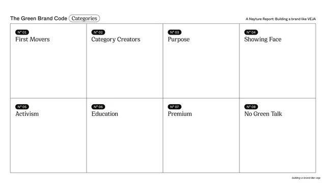
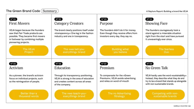
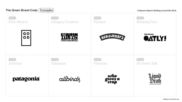
The eight-category grid populated with one example brand logo per cell, with the category labels greyed back so the black logos read as the focus.
Summary
The category grid a third time, now showing one example brand per cell, with the numbered labels faded to grey so the centered black brand logos dominate each cell.
Visual description
White slide, same header with an outlined "Examples" pill. The 4-by-2 grid returns, but the "N°" pills and serif category names are rendered in light grey, receding into the background. Centered in each cell is a black brand logo: GOOD, Tony's Chocolonely, Ben & Jerry's, Oatly, Patagonia, Allbirds, Who Gives A Crap, Liquid Death. The grid rules are faint, letting the logos sit on near-white.
Key takeaway
Greying back the recurring labels so the new content (logos) becomes the figure is a smart way to evolve a repeated grid without redesigning it. Centering each logo gives a clean logo-wall feel while keeping the framework's structure intact.
Reuse notes
A strong "proof by example" slide after defining a framework, mapping real brands onto each principle. Needs clean single-color logo lockups to stay consistent. The fade-the-label technique is reusable any time you layer a new data type onto an existing grid.