Preview image. Unlock full-res
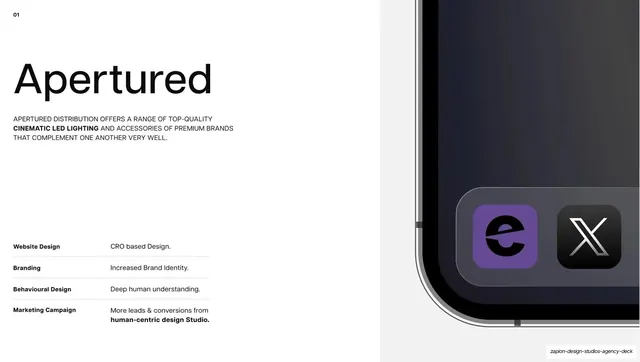
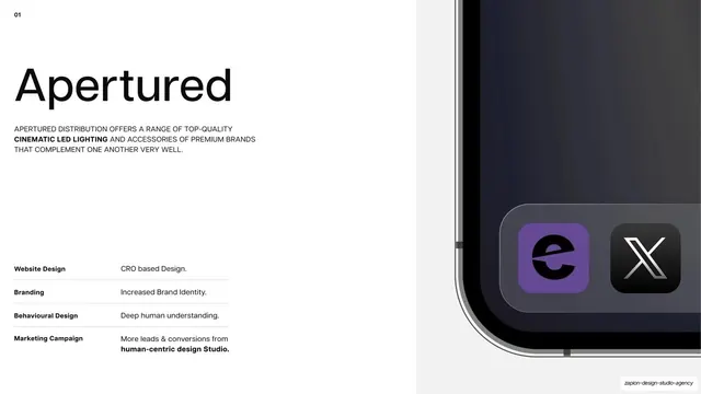
Light case-study intro for Apertured with an index number, big name, all-caps brief and results table on the left, and a full-bleed phone mockup on the right.
Summary
The first case-study intro: "Apertured" set large on the left over a results table, paired with a full-bleed dark phone mockup bleeding off the right edge.
Visual description
White ground on the left two-thirds, a light-grey panel holding the image on the right. A small bold "01" index number sits top-left. Below it, the client name "Apertured" is set very large in lowercase neutral grotesque, followed by a three-line all-caps brief describing Apertured Distribution's cinematic LED lighting range. Lower left, a four-row results table lists "Website Design / CRO based Design.", "Branding / Increased Brand Identity.", "Behavioural Design / Deep human understanding.", and "Marketing Campaign / More leads & conversions from human-centric design Studio.", each row split by a hairline. The right third shows a large close-up of a dark phone corner with the violet Apertured app icon and a black X app icon on its dock.
Key takeaway
The case-study template: an index number, oversized lowercase client name, an all-caps one-paragraph brief, and a fixed four-row results table (Website / Branding / Behavioural / Marketing), paired with a single full-bleed product photo. It makes every case study scannable and directly comparable.
Reuse notes
The anchor layout for the portfolio section, repeated per client (see slides 14 and 16). Reuse it for any case-study or project slide where you want consistent metrics; needs a strong hero image on the right to carry the visual half.
From this deck: Apertured case study intro
View deck







More like this




Keep what you find
A free account saves references to boards and can send you a weekly email of picks based on what you save.
To see every result, go Pro.