Preview image. Unlock full-res
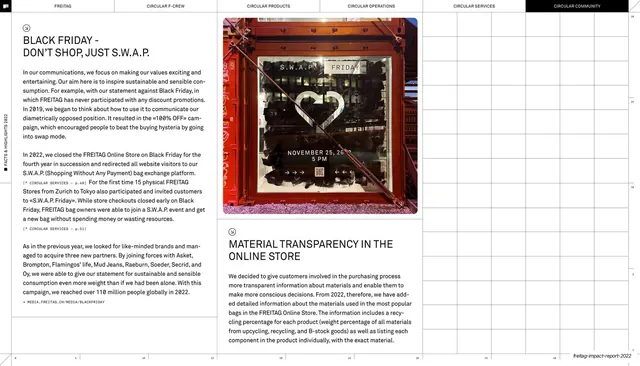
Editorial report page where two columns of campaign body copy wrap around a stacked pair of photographs of a S.W.A.P. storefront.
Summary
A campaign write-up page that runs two columns of body text beside a stacked pair of photos, one of a S.W.A.P. storefront window and one of a tarp-bag display. It shows how the report drops real imagery into its otherwise text-driven grid.
Visual description
White page with the six-chapter top nav, "CIRCULAR COMMUNITY" highlighted black. The left column heads "BLACK FRIDAY - DON'T SHOP, JUST S.W.A.P." over several justified paragraphs with monospace citation tags and a small circular icon. The middle column continues the body copy. The right column is occupied by two photographs stacked vertically: above, a shopfront window with large "S.W.A.P. FRIDAY" lettering and a "NOVEMBER 25, 26, 5 PM" notice; below, a close, slightly muted shot of FREITAG tarp bags on a display. Beneath the lower photo a subhead reads "MATERIAL TRANSPARENCY IN THE ONLINE STORE" with its own paragraph. Thin column rules, a vertical spine label, and the running footer frame the page.
Key takeaway
Letting a vertical stack of two photographs hold one column of an otherwise all-text grid, so a document page gains a campaign-spread feel without breaking the layout. Captioning the lower image straight into the next subhead keeps image and narrative tightly linked.
Reuse notes
A good pattern for case-study or campaign recap pages inside a report where you have a couple of supporting photos but mostly prose. Reuse the photo-column-plus-text-columns split for press, event, or product stories. Depends on decent photography; weak captures will sink the right column.
From this deck: Black Friday S.W.A.P. and online-store transparency
View deck














More like this






Keep what you find
A free account saves references to boards and can send you a weekly email of picks based on what you save.
To see every result, go Pro.