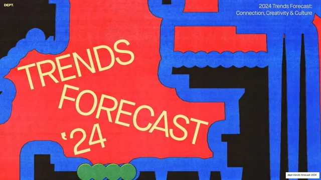
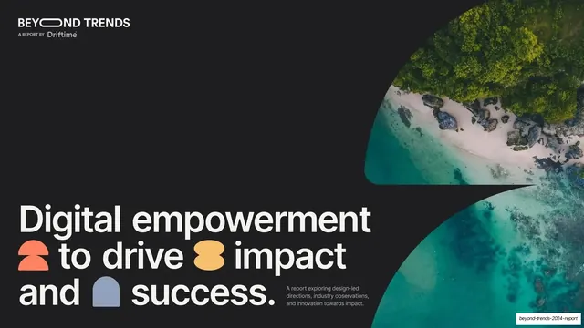
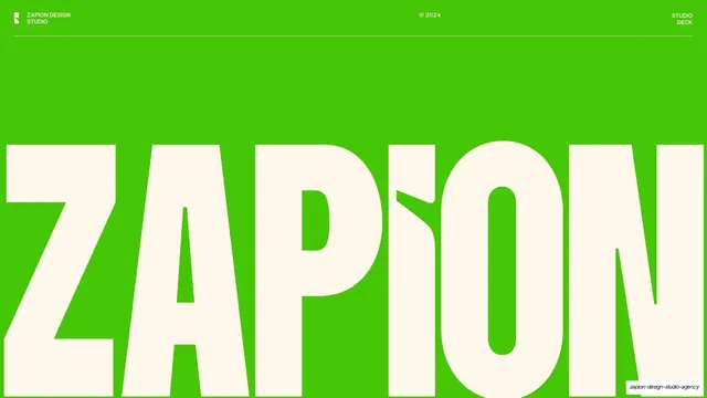
Preview image. Unlock full-res
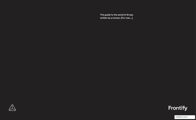
A 13-slide Frontify and Adweek editorial report on generative AI and creativity, alternating dark expert-quote spreads with light long-form article pages set in a single grotesque typeface.
Summary
A 13-slide editorial report from Frontify (with Adweek) collecting six creatives' and one creative team's views on generative AI. Its personality comes from a magazine-style system: dark slides carry oversized expert quotes with portraits, light slides carry long-form article spreads with a single square abstract image and tight body columns, all set in one grotesque typeface.
Visual description
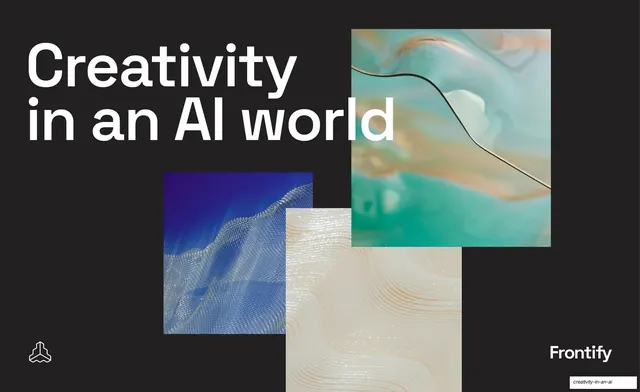
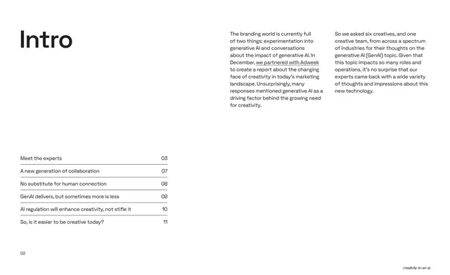
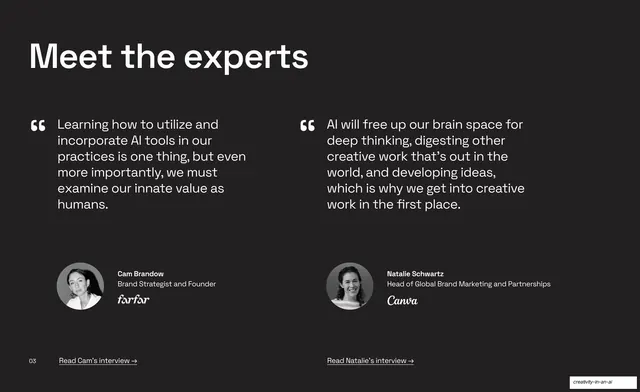
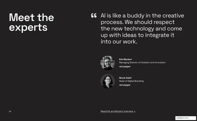
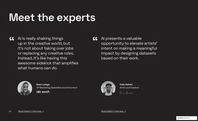
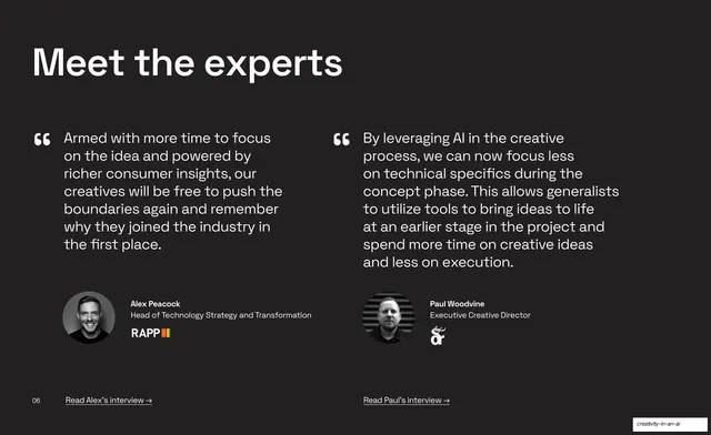
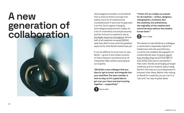
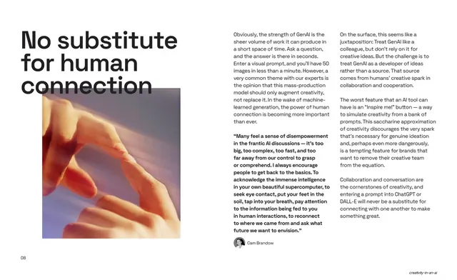
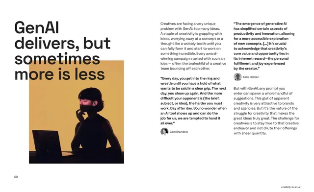
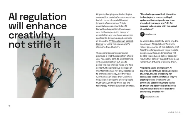
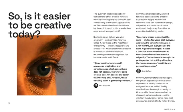
Slides run 16:9 and alternate two modes. The dark mode (#1E1E1E near-black) is used for the cover, the closing slide, and the "Meet the experts" quote spreads: oversized white lowercase grotesque headlines top-left, with one or two large quotation marks introducing expert pull-quotes, each anchored by a circular black-and-white portrait, the expert's name and title, and their company logo (farfar, Canva, red pepper, sinch, RAPP, plus artist signatures). A small page number sits bottom-left and an underlined "Read [name]'s interview" link bottom-center/right. The light mode (white) carries the editorial article pages: a very large dark lowercase headline breaks across three or four lines top-left, a single square or portrait abstract image (chrome knot, soft hand, silhouette against ochre, wired hand, close-up eye, glitch landscape) sits below it, and the right two-thirds holds two narrow justified body columns in small grotesque type with bolded inline pull-quotes, expert mini-avatars, and underlined article links. Imagery is a recurring set of AI-themed abstract photography in cool blues, greens, and warm ochre/orange tones. The Frontify cube logo appears bottom-left and the "Frontify" wordmark bottom-right on both bookend slides. Page numbers and the running footer hold the whole sequence together.
Key takeaway
The two-mode rhythm: dark quote spreads as punctuation between light long-read article pages, so a content-heavy report still has pacing and air. The discipline of one typeface (a single grotesque) carrying both giant headlines and dense body copy. And the expert-quote template (giant quote mark, headline, circular portrait, name/title, client logo, read-more link) repeated identically so six contributors feel like one designed series.
Reuse notes
A strong reference for editorial reports, whitepapers, trend pieces, and thought-leadership decks that mix expert quotes with long-form prose. The dark quote-spread layout and the light article spread (oversized headline + one square image + two body columns + inline pull-quotes) are both directly reusable. Needs real contributor portraits and client logos to carry the dark slides, and genuinely good abstract photography for the light spreads. Works best when the writing is the point; the design deliberately stays out of the way.