Preview image. Unlock full-res
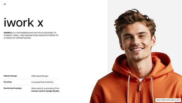
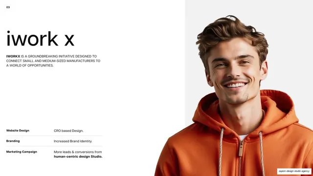
Light case-study intro for iWorkX with an index number, big name, all-caps brief and results table on the left, and a full-bleed portrait in an orange hoodie on the right.
Summary
The third case-study intro: "iwork x" set large on the left over a results table, paired with a full-bleed portrait of a smiling man in an orange hoodie on the right.
Visual description
White ground on the left half. A small bold "03" index number sits top-left. The client name "iwork x" is set very large in lowercase neutral grotesque, followed by a three-line all-caps brief describing iWorkX as a platform connecting small and medium manufacturers to opportunities. Lower left, a three-row results table lists "Website Design / CRO based Design.", "Branding / Increased Brand Identity.", and "Marketing Campaign / More leads & conversions from human-centric design Studio.", each row split by a hairline. The right half is a full-bleed portrait of a smiling young man in a bright orange hoodie against a pale grey backdrop, the orange tying to the iWorkX brand color.
Key takeaway
The case-study template applied a third time, now with a human portrait whose wardrobe color (orange) matches the client's brand accent, quietly reinforcing the brand before the logo reveal. Note the table flexes to three rows when there is no behavioural-design line.
Reuse notes
The portfolio template applied to a B2B platform client. Matching the hero photo's color to the brand accent is a cheap, effective tie-in. The variable row count keeps the table honest when a service category does not apply.
From this deck: iWorkX case study intro
View deck


More like this





Keep what you find
A free account saves references to boards and can send you a weekly email of picks based on what you save.
To see every result, go Pro.