Preview image. Unlock full-res
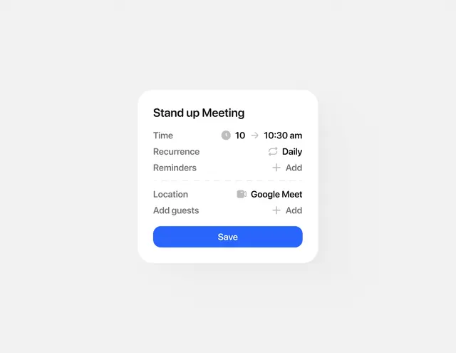
A light mobile form card for creating a scheduled meeting with fields for time, recurrence, location, and guest management.
Summary
A white rounded card on a light gray background with a form for scheduling a standup meeting, featuring time, recurrence, location, and guest-list fields, plus a full-width bright blue Save button.
Visual description
The card is centered on a soft gray background with a rounded white rectangle container. Inside: a heading "Stand up Meeting" in dark sans-serif, followed by four label-value rows. Time shows two input fields (10 and 10:30 am) with clock icon, Recurrence has a dropdown set to Daily, Location links to Google Meet with a location icon, and Add guests has a plus-icon link. Below the inputs is a wide primary button filled in bright cobalt blue with white text reading "Save". All labels are light gray, all values are dark charcoal text, and icons are simple and grayscale. Whitespace is generous between sections, emphasizing clarity over density.
Key takeaway
The light-and-dark text contrast (labels in light gray, values in dark) guides the eye naturally through the form hierarchy. The blue CTA button is isolated at the bottom, making next action obvious. Secondary actions like "Add guests" use text-links-with-icons instead of buttons, avoiding button bloat. The form avoids inline validation or error states, keeping the interface calm and uncluttered.
Reuse notes
Ideal for scheduling, calendar, and meeting-management apps where users need quick form input with preset options (Daily recurrence, location autofill). The generous padding feels mobile-friendly and touch-safe. Copy the text-link pattern for optional secondary fields; it keeps the primary action (Save) visually dominant without a crowded button bar.