Preview image. Unlock full-res
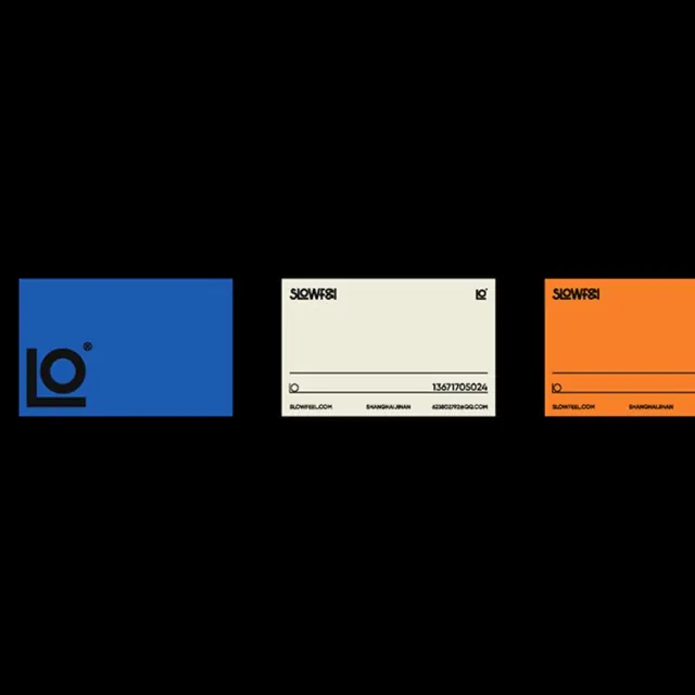
Three business-card mockups in contrasting colors (royal blue, cream, orange) showcasing a bold, minimalist logo mark and structured typographic system.
Summary
Three business-card mockups in contrasting colors (royal blue, cream, orange) showcase a bold, minimalist logo and structured identity system with clean geometric segmentation.
Visual description
Three horizontal business card layouts arranged side by side: a royal blue card with a chunky, geometric 'Lo' logotype and registered mark (bottom left); a cream card with 'slowfeel' wordmark at top, a horizontal dividing line, and contact details below; an orange card echoing the cream card layout with reversed color roles. All cards use thin sans-serif typefaces, tight tracking, and aligned text to a clean grid. The black background isolates each card as a distinct system variant.
Key takeaway
The modular logo system (mark + logotype as separate, stackable elements) that scales from business card to wordmark. The three-color palette creating clear visual distinction while maintaining cohesion through matching layouts. The use of negative space and card edge as container.
Reuse notes
Ideal for minimal corporate or tech brand systems where color and layout clarity matter more than decoration. Works best in print contexts with controlled dimensions. The palette (royal blue, cream, warm orange) is warm-skewed professional and suits fintech, B2B, or marketing firms.
More like this


Keep what you find
A free account saves references to boards and can send you a weekly email of picks based on what you save.
To see every result, go Pro.