Preview image. Unlock full-res
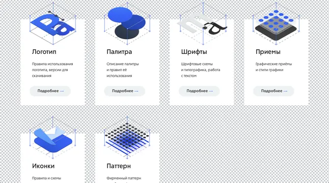
A modular grid of isometric illustrations in blue and gray, depicting design tools and patterns with Cyrillic labels and consistent visual language.
Summary
A 2x3 grid of isometric-drawn design tools and patterns illustrated in a consistent blue and gray palette, demonstrating modular, repeatable illustration style for a brand system.
Visual description
Six isometric illustrations arranged in a two-by-three grid on a light checkered background. Each illustration depicts a design tool or concept: a hand with layers (top left), a three-dimensional sphere shape, a wireframe document or frame, a grid pattern, a layered shape, and a dotted/textured pattern. All use a single palette of medium blue (#5369B3), light gray, and white. Each is drawn with consistent line weight, angle, and level of detail. Below each icon is a Cyrillic label in small sans-serif type, followed by a short description in the same language. The proportions are identical across all six tiles, maintaining grid order.
Key takeaway
The consistency of isometric angle and lighting across multiple illustrations, creating immediate visual family. The restrained color application (blue for primary shapes, gray for secondary elements, white for highlights) that keeps the system readable at small sizes. The pairing of icon with text as a repeatable tile unit that scales to larger systems.
Reuse notes
A strong template for illustrative design system documentation, especially for technical or developer-facing brands. The isometric view adds visual interest while the limited palette keeps it professional. Scale this approach to icon systems, onboarding flows, or feature documentation. Best deployed in dark mode or on light backgrounds; the medium blue provides enough contrast without aggression.