Preview image. Unlock full-res
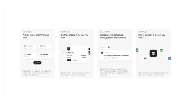
Knowledge base dashboard with four equal-sized cards presenting tutorials and API guides, each with status badges, view counts, and avatars on a light grey background.
Summary
A 2x2 grid of documentation cards, each containing a category label, a heading, a subtitle describing the content, a status badge, view count, and a small author avatar.
Visual description
Four white rounded cards arranged in a 2x2 grid on a soft grey background. Each card has an icon in the top left (rocket, play button, code brackets, or question mark) paired with a category label above a large bold headline and descriptive subtitle. Below the content are a status indicator (green checkmark for "Published" or grey outline for "Draft"), a view count with eye icon, a time indicator ("2 days ago", "1 week ago"), and a circular avatar. The teal, blue, and pink accent colors on icons provide subtle visual distinction. Typography is clean sans-serif throughout, with clear hierarchy from label to headline to description.
Key takeaway
The card-based metadata pattern: status + view count + author avatar + timestamp stacked efficiently without clutter. Each card is self-contained and scannable, pairing functional information (published status, views) with content context (icon, title, description). The soft grey background and white cards with subtle shadows create depth without distraction.
Reuse notes
Excellent for any documentation, learning platform, or content hub where users need to find and evaluate content at a glance. The status badges and view metrics are particularly useful for community-contributed or multi-author platforms. Works well at mobile breakpoints as a full-width single column.