Preview image. Unlock full-res
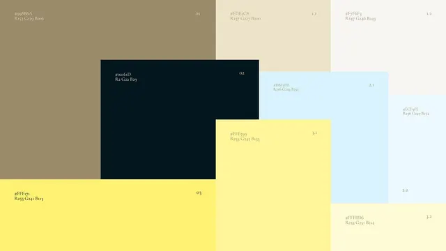
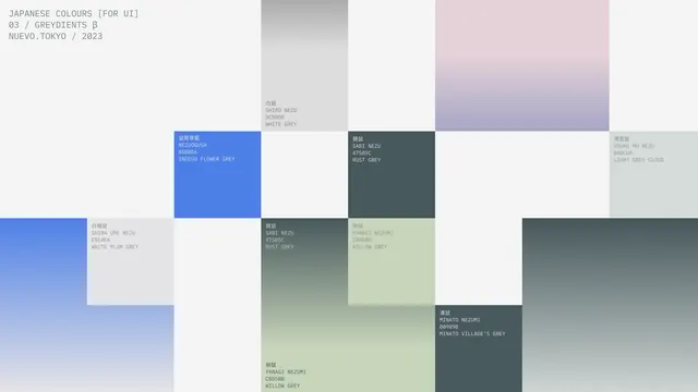
Modular color palette grid for UI design, organized by tone and gradient progression, with Japanese labels and soft muted hues.
Summary
Modular color palette reference grid organized by tone and gradient progression, with Japanese labeling and soft, muted hues suitable for contemporary UI and branding systems.
Visual description
A grid-based swatch display with small square color samples arranged across the composition. Each swatch is paired with small Japanese text labels identifying tone, hue family, and usage notes. The palette emphasizes soft muted tones: pale grays, dusty pinks, slate blues, muted greens, and off-whites. A gradient progression is visible across adjacent swatches, showing tonal and hue relationships. Top-left corner bears the header "JAPANESE COLOURS (FOR UI)" with metadata "03 / GRADIENTS β" and "NUEVO, TOKYO / 2023". The overall visual language is refined and systematic, with precise typography and careful spacing. Color relationships are apparent through visual proximity and tonal matching.
Key takeaway
The grid organization that makes tonal relationships and gradient progressions immediately visible; the paired Japanese and English labeling system that surfaces cultural color naming traditions; the restraint of the palette itself, avoiding saturation in favor of nuance, which translates readily to sophisticated UIs and branding.
Reuse notes
Essential reference for projects building muted, contemporary, or Japanese-influenced color systems. The soft palette is versatile across fashion, editorial, product design, and tech interfaces. The gradient progressions are practical for establishing tonal hierarchies in design systems. Useful for study of how cultural color traditions can inform digital-age palettes without feeling derivative.