Preview image. Unlock full-res
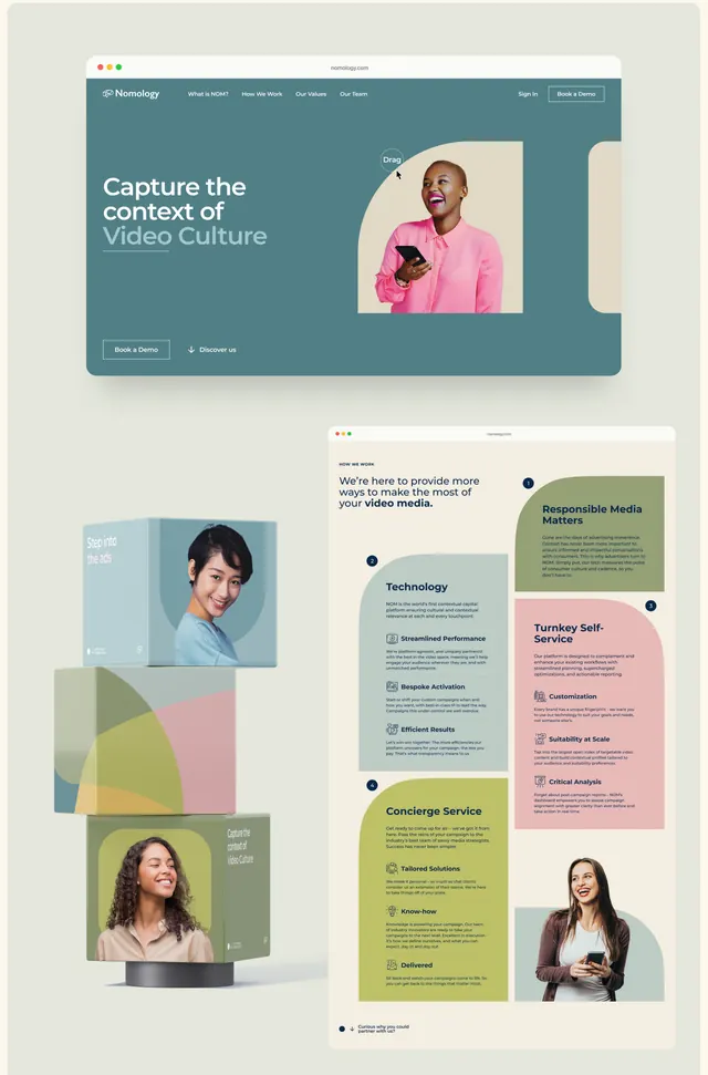
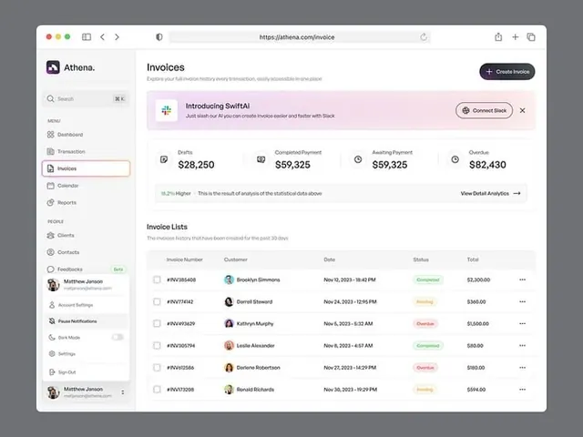
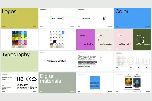
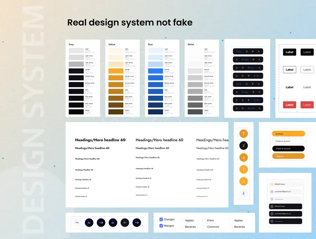
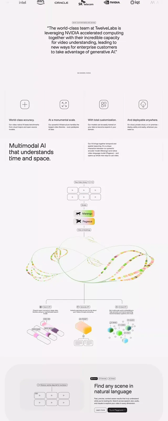
Design system documentation for a video intelligence platform, spanning type specimens, color grids, product mockups, and component guidelines across a multi-panel layout.
Summary
Multi-panel design system guide for a video intelligence SaaS platform, showing typography hierarchy, color language, device mockups, and UI component specs in a structured grid.
Visual description
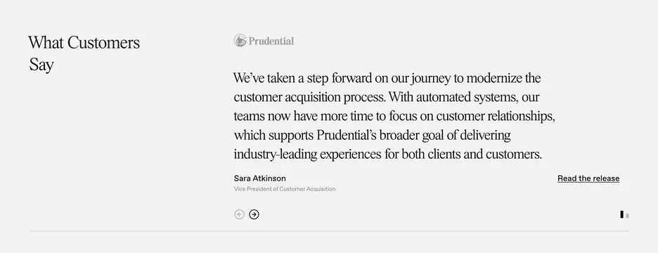
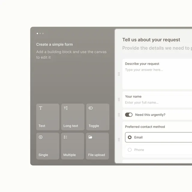
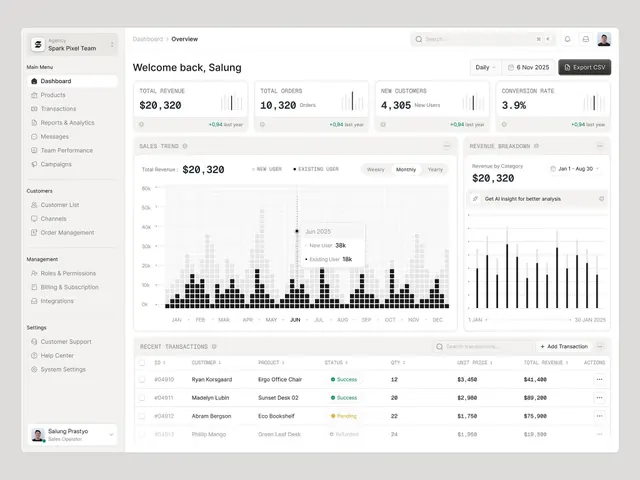
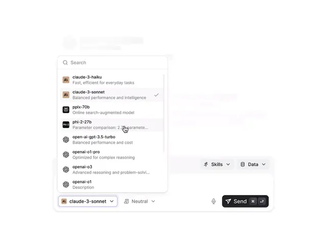
A vertically scrolling presentation spanning at least 10 distinct panel cards, each illustrating different facets of a unified design system. Top panels show serif-sans stacks and type specimens at various weights. Middle sections include a modular color grid with muted greens, teals, and warm neutrals, plus flat geometric icons (checkmark, eye, circle, settings, etc.) in groups. Lower panels display device mockups showing video intelligence interfaces and dashboard layouts with chart elements and sidebar navigation. Background is consistently white with ample breathing room; typography favors clean sans-serif throughout. A lime/yellow-green accent color punctuates select components.
Key takeaway
The structured presentation of a complete design system across a single vertical scroll. The restrained, muted palette combined with one strategic accent color. The blending of type specs, color documentation, icon sets, and live product mockups into one cohesive reference.
Reuse notes
Useful as a template for documenting AI/SaaS design systems or creating style-guide presentations. The multi-panel card approach scales well for pitching a complete brand language to stakeholders or engineering teams. Works best for B2B platforms where professionalism and clarity of specification matter over visual impact.