Preview image. Unlock full-res
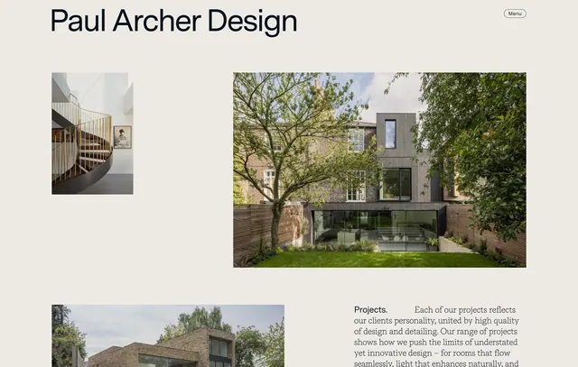
Website homepage for an architecture firm showcasing project images and sans-serif branding over a soft cream background with restrained layout.
Summary
A minimal architecture portfolio website with a cream background, left-aligned sans-serif branding, and a grid layout mixing project photography with editorial copy.
Visual description
A clean, horizontal website layout with "Paul Archer Design" in large, dark sans-serif type top-left. A "Menu" affordance sits top-right. The background is soft cream or off-white. Images are arranged in a loose grid: a smaller residential interior shot on the left, a larger exterior architectural photograph on the right showing brick and glass detail, and a landscape shot below with copy. Muted earth-tone palette of olive-greens, taupes, and warm whites creates a sophisticated, restrained feel. Typography is minimal, body text is small and dark.
Key takeaway
Restraint and white space serve as design elements. A muted natural color palette and generous spacing create confidence and sophistication without ornamentation. The irregular grid and image hierarchy guide the eye without feeling rigid.
Reuse notes
Strong template for professional services, architecture, or design portfolios. The neutral palette and minimal typography work across B2B and luxury contexts. The mixed image grid and editorial approach suit portfolios or case-study-heavy websites. Scale the layout responsively for mobile.