Preview image. Unlock full-res
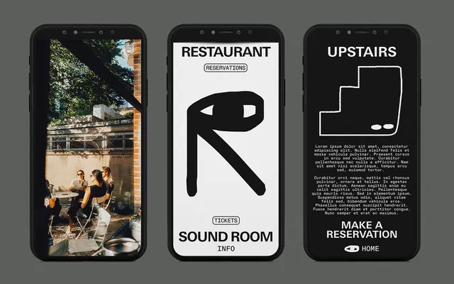
Three mobile app screens for hospitality: venue photo, reservations interface with bold R icon, and waiter app with floor plan.
Summary
Three dedicated mobile app screens for restaurant management: left screen shows venue imagery, center displays reservations with a stylized R icon, right shows floor layout for waiter service.
Visual description
Three black-frame phones arranged horizontally, each displaying a distinct function. Left phone shows a high-contrast photograph of an outdoor dining venue. Center phone has a white background with large black title "RESTAURANT", a bold abstract R icon (minimalist line-style), section labels "RESERVATIONS" and "TICKETS SOUND ROOM INFO" in small caps, and a black pill-shaped button. Right phone displays "UPSTAIRS" with a white floor-plan outline, repeated body text, and a "MAKE A RESERVATION HOME" call-to-action above a black button. All screens use stark black and white with grey backgrounds, heavy sans-serif display type for headings, and minimal supporting imagery.
Key takeaway
The function-specific screen design language (each app has a clear purpose) allows users to understand what they are doing at a glance. The bold minimalist icon (the R) becomes a visual anchor. The use of architectural line-drawing (floor plan) works effectively in high-contrast. The all-caps small caps labels provide clear sectional hierarchy.
Reuse notes
Strong pattern for multi-tool hospitality, booking, or operational software where users switch between roles (diner, reservations manager, staff). The monochromatic palette and bold typography work well when clarity and professional distance are needed. Requires strong typography skills to avoid looking austere.