Preview image. Unlock full-res
Bold two-color brand system using high-contrast red and navy with a modular grid structure and clean sans-serif typographic hierarchy.
Summary
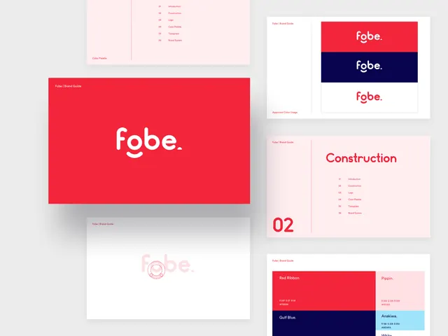
A modular brand guideline system centered on two bold colors, red and navy, showing wordmark treatments, section structure, and approved color use with numbered guide sections.
Visual description
A structured grid of brand-guideline pages showcasing the Fobe identity. A pink navigation panel on the upper left lists guide sections numbered 01-06 (Introduction, Construction, Logo, Color Palette, Typography, Brand System). The hero page presents the wordmark "fobe." on a full-bleed red background. Adjacent pages display the wordmark against navy and white backgrounds, showing three approved color applications. A large "02" section divider in red introduces the Construction page with repeated section labels. Below, additional pages show color swatches labeled "Red Ribbon", "Pippin", "Gulf Blue", and "Anakiva", with RGB values, arranged in a clean grid on white. The typographic treatment is consistent sans-serif, light gray on white and white on colored backgrounds.
Key takeaway
The two-color blocking approach creates maximum contrast and brand presence across minimal palette. The structured numbering and section-divider design (large numerals) makes guidelines scannable and memorable. Showing the wordmark across three color variations demonstrates flexibility within constraint.
Reuse notes
Ideal for corporate, fintech, or B2B brands needing clear authority and memorability. The modular grid structure scales well for multi-page guidelines. The red-and-navy pairing is high-confidence for professional, tech-forward contexts. Works best when each section has ample white space to prevent visual fatigue.